Free counters!

Blog - Reviews

Etsy _print on demand

31 Jan, 2023
0    

Etsy

Is a popular online marketplace that allows small businesses, artists, and independent sellers to sell their handmade, vintage, and unique products to a global customer base.

One of the most popular product categories on Etsy is print-on-demand (POD) mugs and t-shirts.
POD is a digital printing method that allows for individual items to be printed only as they are ordered, rather than in bulk.

This eliminates the need for sellers to hold large quantities of inventory, reducing overhead costs and minimizing the risk of unsold merchandise.
Etsy offers several POD printing options for mugs and t-shirts, including direct-to-garment printing and sublimation printing.

Direct-to-garment printing uses a specialized printer to apply designs directly onto fabric, while sublimation printing uses heat to transfer dye into fabric, creating a long-lasting, vibrant design few exaples here : https://www.etsy.com/uk/TechSignatureArth/listing/1388815860/backpack-bright-colours-unisex-paint?utm_source=Copy&utm_medium=ListingManager&utm_campaign=Share&utm_term=so.lmsm&share_time=1675167794521

or : https://www.etsy.com/uk/TechSignatureArth/listing/1388817396/backpack-floral-theme-roses-flower-cute?utm_source=Copy&utm_medium=ListingManager&utm_campaign=Share&utm_term=so.lmsm&share_time=1675167832279

also : https://www.etsy.com/uk/TechSignatureArth/listing/1402926103/motivational-pillow-inspirational?utm_source=Copy&utm_medium=ListingManager&utm_campaign=Share&utm_term=so.lmsm&share_time=1675167866426

For sellers, using a POD service allows them to focus on creating designs and promoting their products, rather than managing the printing and fulfillment process.

POD providers handle the printing, shipping, and customer service, freeing up time for sellers to focus on other aspects of their business.
POD mugs and t-shirts (- example : https://www.etsy.com/uk/TechSignatureArth/listing/1388815108/t-shirt-abstract-art-face-unisex-paint?utm_source=Copy&utm_medium=ListingManager&utm_campaign=Share&utm_term=so.lmsm&share_time=1675168184035 ) are popular on Etsy because they offer customers unique, high-quality products without the need for large minimum orders. Sellers can offer a wide range of designs and styles, from humor and pop culture references to personalization and customization options.

Few examples here: https://www.etsy.com/uk/TechSignatureArth/listing/1388804238/circle-of-trust-mug-with-color-inside?utm_source=Copy&utm_medium=ListingManager&utm_campaign=Share&utm_term=so.lmsm&share_time=1675168034116

or : https://www.etsy.com/uk/TechSignatureArth/listing/1402852485/do-not-anger-the-gods-mug-coffee-mug-tea?utm_source=Copy&utm_medium=ListingManager&utm_campaign=Share&utm_term=so.lmsm&share_time=1675168065417

also : https://www.etsy.com/uk/TechSignatureArth/listing/1402904429/valentines-day-mug-love-respect-funny?utm_source=Copy&utm_medium=ListingManager&utm_campaign=Share&utm_term=so.lmsm&share_time=1675168110741

Etsy’s POD mugs and t-shirts are also eco-friendly, as they eliminate waste by only printing what is sold. This helps to reduce environmental impact, making them a popular choice for customers who are conscious about their impact on the environment.
In conclusion, Etsy and POD mugs and t-shirts offer a great opportunity for small businesses, artists, and independent sellers to reach a global customer base with their unique designs. POD eliminates the need for large quantities of inventory and offers a hassle-free printing and fulfillment process, allowing sellers to focus on creating and promoting their products. With a wide range of styles and customization options, POD mugs and t-shirts are a popular choice for customers looking for unique, high-quality products.

OnePlus 9 Pro Review

24 Mar, 2021
0    

Introduction

OnePlus continues to find its place in the smartphone industry with the OnePlus 9 duo. The 9 and 9 Pro establishes OnePlus with a new partnership in the camera space - every major Chinese OEM has one, after all. With the new smartphones bearing the "Hasselblad" name, does the OnePlus flagship finally have a camera experience free of compromises? OnePlus uses the tagline "Your best shot" so we are setting our expectations high for the cameras' performance.

OnePlus has entered into a three-year cooperation agreement with Hasselblad and the first phones to benefit from that are the OnePlus 9 and 9 Pro. For these phones, Hasselblad and OnePlus collaborated on calibrating the contrast and color processing with a view of tuning them to Hasselblad's distinct style.

OnePlus 9OnePlus 9 Pro
OnePlus 9 • OnePlus 9 Pro

In this review, we'll focus on the larger of the two phones. The OnePlus 9 Pro's overall look does not deviate far from its predecessors, but it does dial back on a couple of design elements that help to improve the phone's ergonomics. The centered linear arrangement of cameras is no more, and the 9 Pro now has a more conventional camera placement in a rectangular setup.
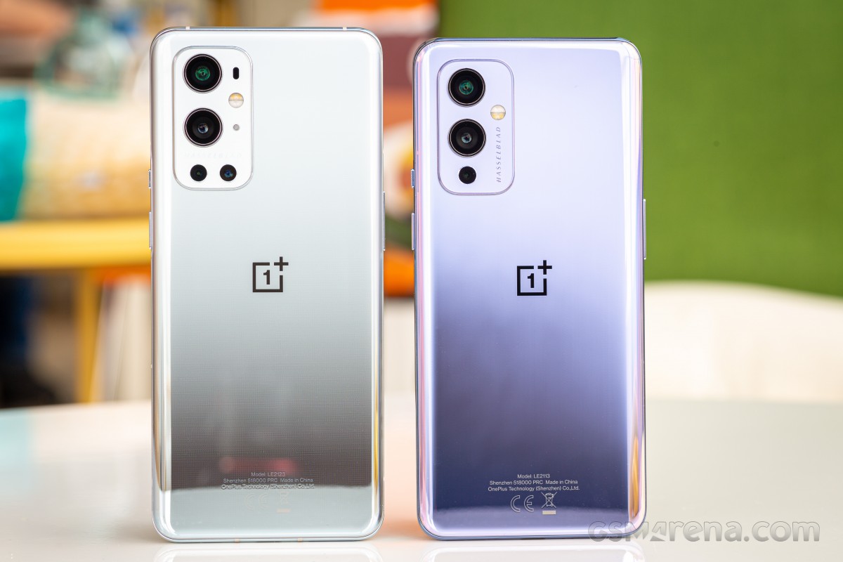
OnePlus 9 Pro reviewOnePlus 9 Pro next to OnePlus 9

The display on the 9 Pro uses a new display technology that OnePlus promises should reduce the power consumption of the panel by up to 50 percent. The savings is credited to a new LTPO backplane in the AMOLED panel. This enables the new 'Smart 120Hz' feature that variably adjusts the refresh rate all the way down to 1Hz if it needs to.

Debuting with the OnePlus 8T last year, the 9 Pro now sports the same dual-cell battery system compatible with an included 65W charger, capable of fully replenishing the 9 Pro's battery in just about a half-hour but with improved charging software and lower internal battery resistance, they've been able to provide even faster initial charging from flat. OnePlus is also debuting a faster Warp Wireless charger with the 9 Pro that outputs 50W and we'll be giving that a test as well.

OnePlus 9 Pro specs:

  • Body: aluminum frame and glass construction, 3D Gorilla Glass back and dual-curved display edges, Gorilla Glass 5 front and back.
  • Display: 6.7" Fluid Display 2.0 (LTPO AMOLED), 10-bit color, 120Hz, HDR10+, MEMC, Automatic color temperature setting, 1,300 nits (peak), 1440x3216px resolution (20.1:9).
  • Chipset: Qualcomm SM8350 Snapdragon 888 (5 nm): Octa-core (1x2.84 GHz Kryo 680 & 3x2.42 GHz Kryo 680 & 4x1.80 GHz Kryo 680); Adreno 660.
  • Memory: 8GB or 12GB LPDDR5 + 128GB or 256GB UFS 3.1 storage (non-expandable).
  • OS/Software: OxygenOS 11 based on Android 11.
  • Rear cameras: Wide (main): Sony IMX789 48 MP, 1/1.43", f/1.8, 23mm, 1.12 µm Multi Autofocus (PDAF+LAF+CAF), OIS + EIS; Ultra wide angle/macro: Sony IMX766 50MP, 1/1.56", f/2.4, 14mm, Freeform lens; Telephoto: 8MP, 3.3x zoom, 1.0µm pixels, f/2.4, 77mm equiv; Monochrome: 2MP.
  • Front camera: Sony IMX471 16MP, f/2,4, 1.0 µm pixel size, fixed focus, EIS.
  • Video capture: 8K @ 30fps, 4K @ 30/60/120fps, Super Slow Motion 720p @ 480fps, 1080p @ 240fps, 4K time-lapse, DOL-HDR.
  • Battery and charging: 4,500 mAh dual-cell battery, Warp Charge 65T, Warp Charge 50 Wireless, Reverse wireless charging @ 5W.
  • Misc: In-display optical fingerprint scanner; front RGB sensor (for automatic tone adjustment), alert slider.

Apart from the screen size and resolution, the main difference between the 9 and 9 Pro's camera systems is the addition of a dedicated telephoto camera on the OnePlus 9 Pro. The main camera gets an updated IMX789 Sony sensor which still supports omnidirectional Phade Detection auto focus and dual native ISO, and the ultra-wide now gets a 50MP sensor and a new type of lens to reduce lens distortion.

Video recording has been beefed up to support 8K video at 30 frames, and 4K video at 120 fps. There's also a new Nightscape Video 2.0 which promises better low-light video so we're looking at all-around improvements to the camera system on the 9 Pro.
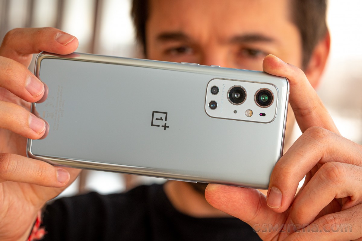
OnePlus 9 Pro review

We're excited to see how much the image quality has improved on the camera trio (main, tele, wide) of the 9 Pro with this new Hasselblad partnership. We'll also be looking to see how much battery life will improve despite having the same 4,500 mAh capacity as its predecessor. The lower-power display and Snapdragon 888 with integrated Qualcomm X60 modem should help in this regard.

Tag along as we look over the ins and outs of OnePlus' new flagship device. If you're looking to upgrade from an older OnePlus device, we'll give you the scoop on whether the 9 Pro is improved in all the right places or if it's more like a scoop of ice cream you've already tasted before.

Unboxing

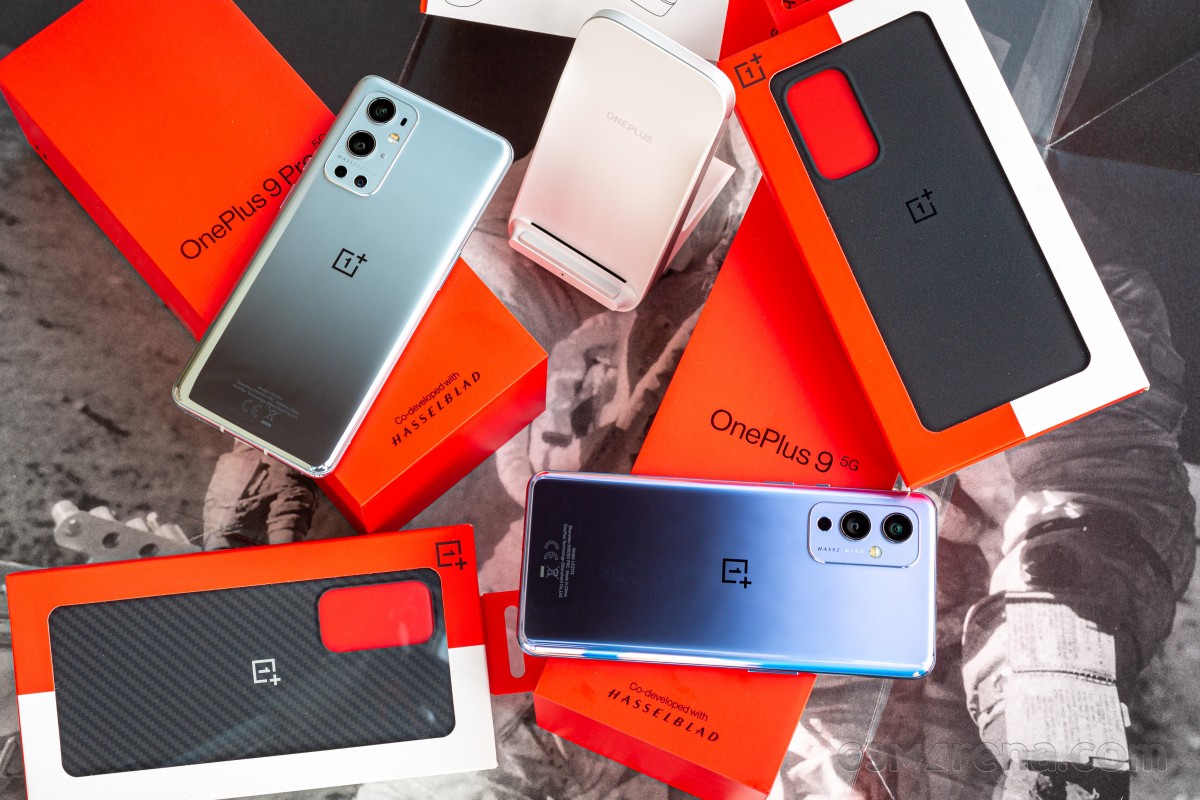
The media package that we received from OnePlus included both the OnePlus 9 and 9 Pro, along with one protective case for each, and the Warp Charge 50 Wireless Charger. This time around, some may be happy to learn that the new Wireless charging dock does come with a removable connector and supports any 50W USB-C PD charger.
OnePlus 9 Pro review

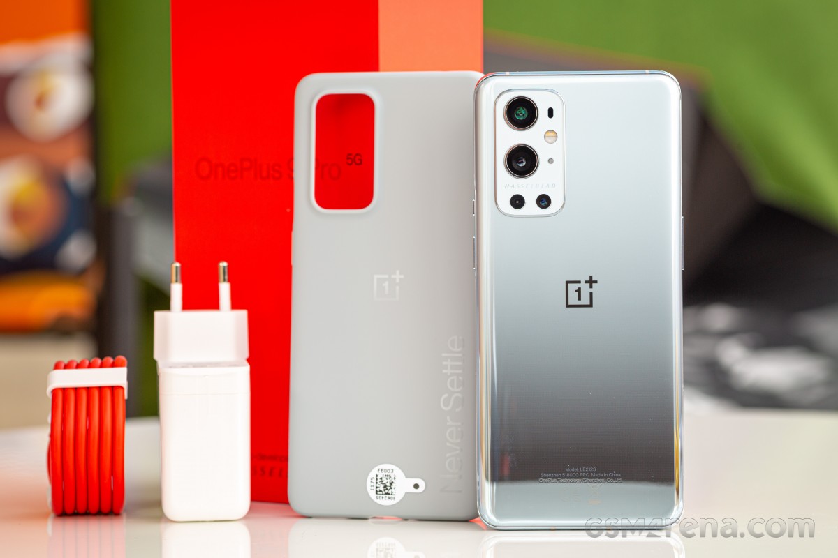
The OnePlus packaging has become a standard fare and the 9 Pro is no exception. Inside the now familiar red box is the phone at the top layer, followed by some paperwork, a silicone case in some markets, the 65W Warp Charge power adapter, and the usual red Type-C to Type-C USB 2.0 cable.

The silicone case this year has been switched to an opaque design. It's not clear yet why OnePlus chooses to omit this accessory in some markets and decides to leave it in elsewhere. There will be aftermarket cases, obviously, along with some first-party options from OnePlus.
OnePlus 9 Pro review

Two things that we can always count on OnePlus smartphones to come with are a set of OnePlus stickers, and a letter from the company's founder Pete Lau that encourages customers to participate in the OnePlus community forums. A SIM tool is attached to this letter.

As usual, there are no audio accessories inside the package. Not even an audio adapter.

Design

The OnePlus 9 Pro continues the brand's tradition of having pleasant but unremarkable designs. While other manufacturers are being more bold and experimental, OnePlus seems content with a safe design that is inoffensive but also somewhat generic and forgettable.

The OnePlus 9 Pro inherits most of the OnePlus 8 Pro design aesthetics but makes some notable improvements. The phone is now both shorter and narrower and while the difference isn't much, it feels much more manageable and comfortable to use, even though the weight hasn't changed.

The OnePlus 9 Pro also loses the aggressively curved display of the OnePlus 8 Pro. While the display is still curved, it's a much more subtle curve that doesn't extend as further down the sides as the 8 Pro did. This has a few advantages, which we shall discuss in the display section.
OnePlus 9 Pro review

Along the sides, we find the power and alert slider on the right and the volume buttons on the left. The volume buttons have been shifted down significantly compared to the 8 Pro. This makes it much easier to operate in portrait orientation and the volume buttons also don't rub against your pinky finger when held in landscape mode.

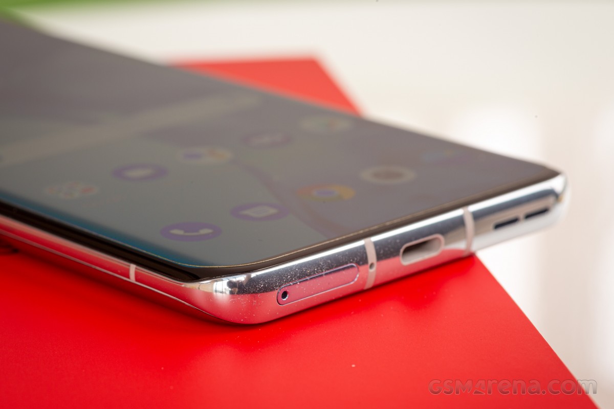
The bottom of the phone is identical, with the same two-slot speaker grille, USB port, and SIM tray design. The top of the phone loses the horizontal cleft and is a simple curve.

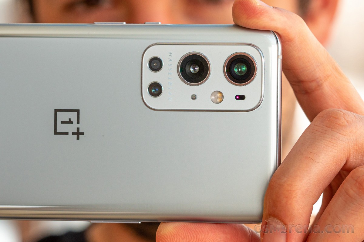
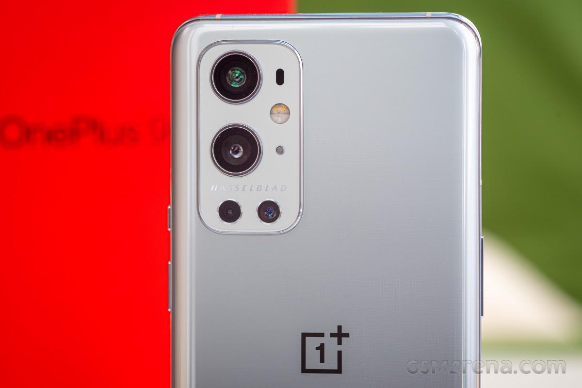
The back of the phone houses the most noticeable difference. The OnePlus 8 Pro had the more distinctive OnePlus camera array in a vertical pill shape in the center. The camera had a rather significant bump to it but it wasn't an issue since it was centered and so the phone still felt mostly stable. The OnePlus 9 Pro switches to a new camera array with the Hasselblad branding in the top left corner, similar to many other designs on the market today. The camera bump doesn't stick out as far on the new model but because it's in the corner the phone does rock back and forth on the desk.
OnePlus 9 Pro review

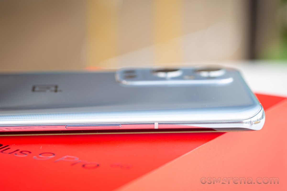
The OnePlus 9 Pro comes in three colors and finishes. Our review unit came in Morning Mist, which has a glossy finish that gets progressively more reflective as you go down the back of the phone. Pine Green has a rather familiar shade of green with a matte finish. Stellar Black is the most interesting as its frosted matte finish has a similar texture to the sandstone back of older OnePlus phones. Morning Mist is the only finish that has a shiny frame, the other two have matte finishes.

Both the Pine Green and Stellar Black variants are said to be fingerprint resistant, which is great because the back of the Morning Mist looks like a crime scene after a few minutes of use.

While Morning Mist is the company's featured finish, it doesn't really have that 'wow' factor that OnePlus has achieved in previous years: the iridescent effect of the 7 Pro's Nebula Blue and the breathtaking deepness of the 8 Pro's Ultramarine Blue.

Even still, Morning Mist is an elegant finish, and It reminds us of Mercedes Benz's Diamond Silver paint job. We've also received comments that it's reminiscent of liquid metal / mercury.
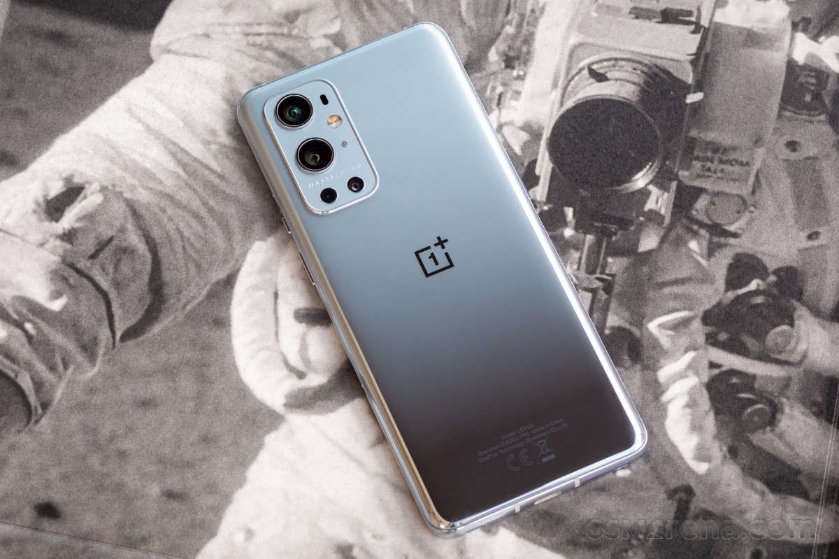
OnePlus 9 Pro review

Like the OnePlus 8 Pro, the OnePlus 9 Pro is dust and water-resistant with an IP68 rating. Aside from that, the phone feels well-built with a premium finish and a nice, dense feel in hand. It's still a glass phone, however, so you will need a case for drop protection. Also, it's worth noting that OnePlus is sticking with Gorilla Glass 5 for both the front and back of the phone, so you're not exactly getting the latest in shatter resistance.

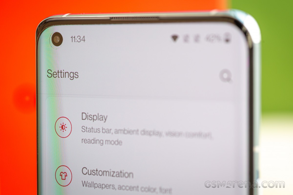
The first thing we noticed when setting up the handset is the placement of the in-display fingerprint scanner - it's significantly lower. This doesn't drastically change the phone's ergonomics and usability. In a worst-case scenario, it may take a couple of days to get used to the new placement.
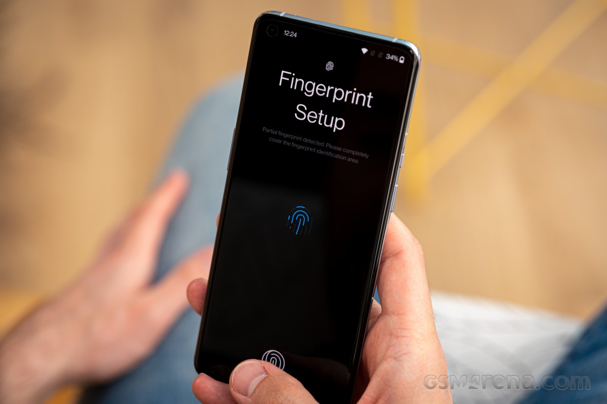
OnePlus 9 Pro review

The overall size of the 9 Pro is slightly smaller than the 8 Pro at 163.2 x 73.6 x 8.7mm. It's just 2 grams lighter than the 8 Pro at 197g. The display now measures 6.7-inches and the slight change in aspect ratio to 20.1:9 means that although the phone's width is identical to that of the 8 Pro, it also loses a small chunk of length that makes the phone slightly less unwieldy.

The camera setup on the back houses four cameras in a rectangular arrangement. The top camera is the ultrawide, followed by the main 48MP shooter. The lower-left camera is a 2MP monochrome sensor and the last one is the 3.3X telephoto camera. On this cluster you'll also find an AF laser, the video microphone and flash.
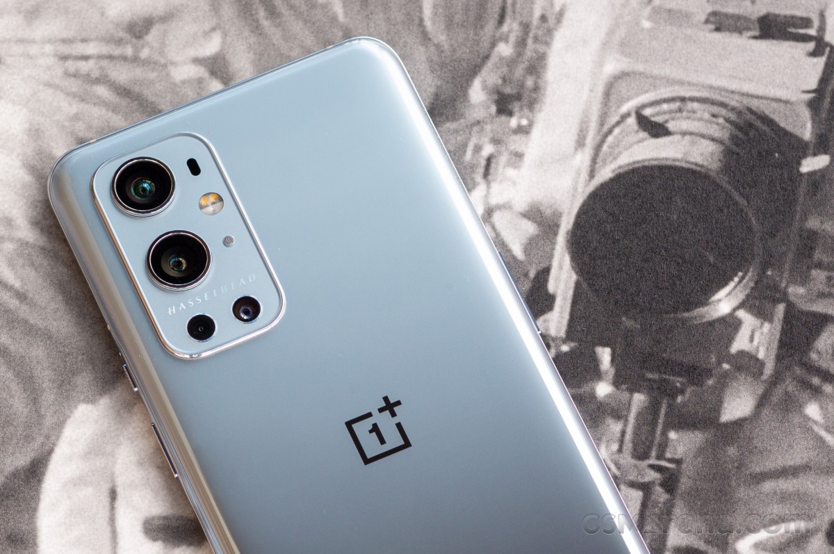
OnePlus 9 Pro review

The ports, mics, speakers, and buttons are all laid out almost exactly as they are on the 8 Pro. The ridge that was carved into the top end of the phone is no more, but here is where you'll find a noise-canceling microphone.
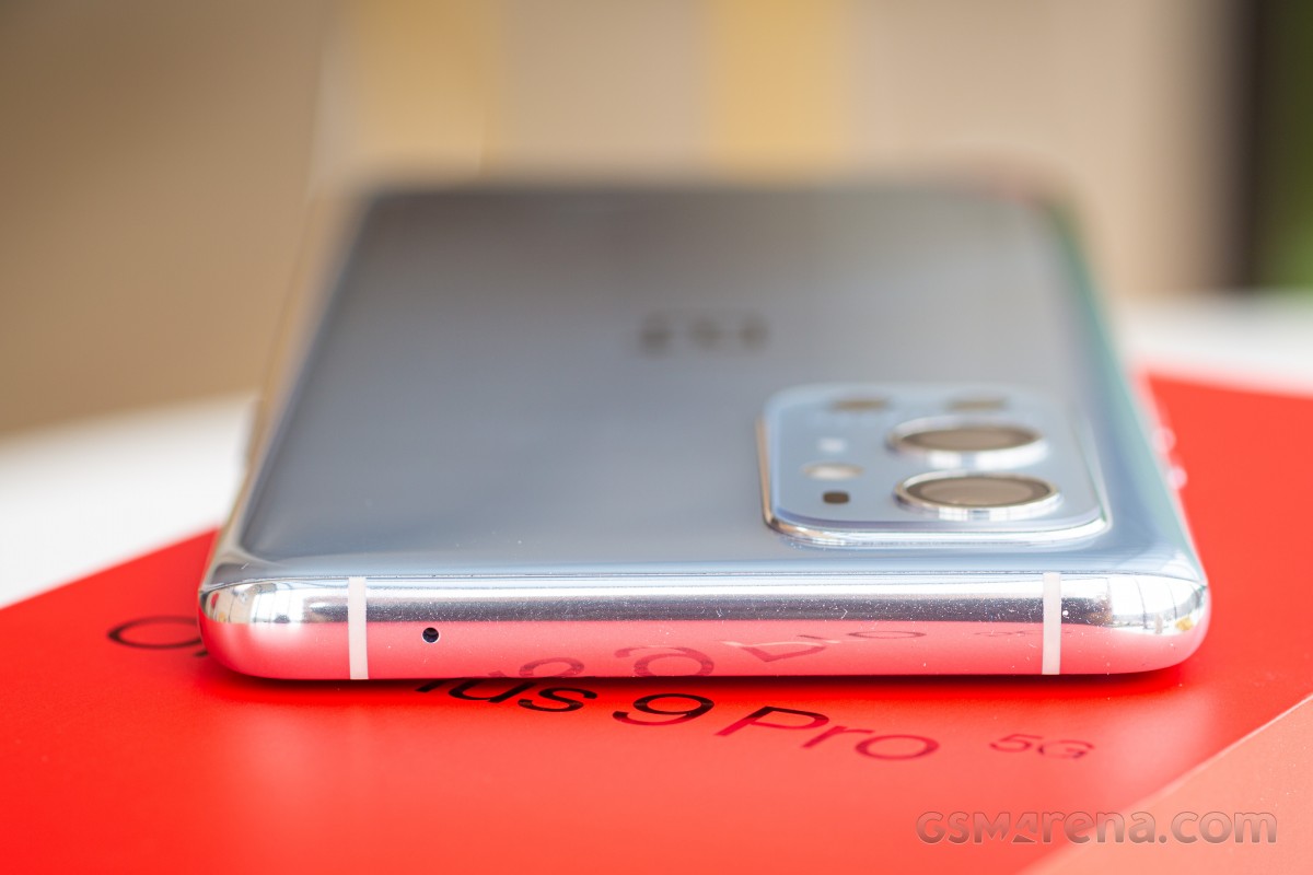
OnePlus 9 Pro review

There's a volume rocker on the left side, and at the bottom of the phone is the USB-C charging port. The SIM tray is here as well, and it will hold two nanoSIM cards. Remember, the 9 Pro (and 9) do not offer expandable storage. The downward speaker has the same dual-slotted port as well.
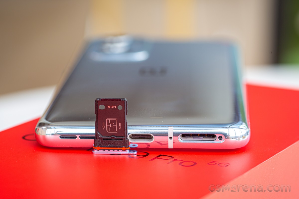
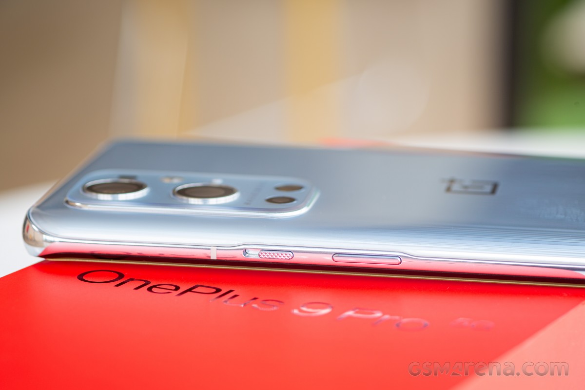
OnePlus 9 Pro reviewOnePlus 9 Pro reviewOnePlus 9 Pro review

Overall, the OnePlus 9 Pro design improves upon its predecessor in many small ways. It's also built very well and feels sturdy and premium. Unfortunately, it's still a fairly large and heavy device but that seems to be the norm these days with flagship smartphones. Also, the design is a bit generic in our opinion compared to some of the competing smartphones and we wish OnePlus would come up with something more unique and eye-catching in the future.

The design is not strikingly different from its predecessors. If it were not for the new camera partnership, the OnePlus 9 Pro would otherwise seem like an incremental change.
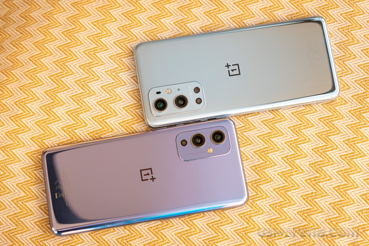
OnePlus 9 Pro review

Although OnePlus' intention with the reduced screen curvature was to eliminate accidental touches, we found in our use that the palm rejection still needs some tweaking.

Next up, we'll look at our lab test data to see how much the display has changed in one year. We will also dive into the battery tests results and take a quick look at the phone's loudspeakers.

Fluid Display 2.0 with Smart 120Hz

The OnePlus 9 Pro has a 6.7-inch, 3216 x 1440 resolution, 10-bit LTPO AMOLED display. The display has a variable refresh rate that maxes out at 120Hz. It is capable of HDR (high dynamic range) and OnePlus has included support for HDR10, HDR10+, and HLG standards.
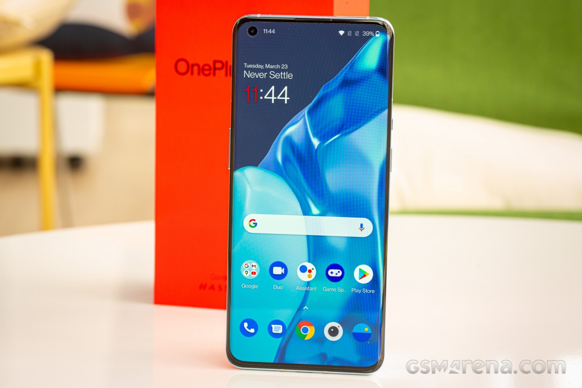
OnePlus 9 Pro review

In our regular testing method for brightness, we use a pattern size of 75% but the OEMs are free to decide how they test their claims. Using a much smaller 15% pattern size, we were able to measure 1,150 nits of max brightness. Although not quite the advertised 1,300, not far from it.

For the sake of GSMArena's comparisons and the pattern size we use across all our device reviews, the 9 Pro's display reached a maximum brightness of 871 nits with Adaptive brightness switched on. With this setting turned off, the panel caps at 523 nits and these scores reflect the display's excellent sunlight readability.

Display test 100% brightness
Black,cd/m2 White,cd/m2 Contrast ratio
Samsung Galaxy S21 Ultra 5G (Max Auto) 0 1023
Xiaomi Mi 11 (Max Auto) 0 926
OnePlus 8 Pro (Max Auto) 0 888
Samsung Galaxy S21+ 5G (Max Auto) 0 883
OnePlus 9 Pro (Max Auto) 0.038 871 22921:1
Apple iPhone 12 Pro Max 0 822
OnePlus 9 (Max Auto) 0 821
OnePlus 8T (Max Auto) (Prassad) 0 815
Huawei Mate 40 Pro (Max Auto) 0 807
OnePlus 8 (Max Auto) 0 803
Apple iPhone 12 Pro 0 802
Oppo Find X3 Pro (Max Auto) 0 774
Apple iPhone 12 0 639
OnePlus 8 Pro 0 538
OnePlus 9 Pro 0 525
OnePlus 8T (Prassad) 0 518
Xiaomi Mi 11 0 498
OnePlus 8 0 496
Oppo Find X3 Pro 0 493
Huawei Mate 40 Pro 0 485
Samsung Galaxy S21+ 5G 0 459
Samsung Galaxy S21 Ultra 5G 0 458
OnePlus 9 0 450

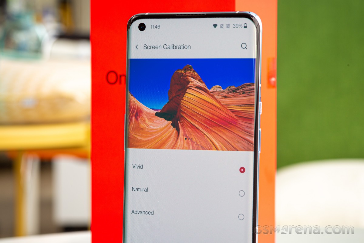
OnePlus' default Vivid mode has pleasing colors and bright whites. This is the typical, punchy profile that most people will have on their device. If you're someone who would rather give your peepers a rest, or prefer something more accurate, OnePlus has you covered as well.

In the default Vivid mode, the display scored an average deltaE of 3.1 with a maximum of 5.8. sRGB is the most color-accurate mode, scoring an average deltaE of just 0.7 and a max deviation of 1.7. Remember, any score below 2 is visually indistinguishable to the eye.
OnePlus 9 Pro review

There are more profiles to choose from. Natural is closely related to sRGB, but not as color accurate. Under the 'advanced setting'. The AMOLED Wide Gamutis the most color-saturated profile for those who really want colors to look over-the-top and exaggerated. sRGB and Display P3 emulate the colors from their respective spaces. The latter three 'Advanced' profiles can be adjusted with sliders for warm/cool and green/magenta.

Display settings - OnePlus 9 Pro reviewDisplay settings - OnePlus 9 Pro reviewDisplay settings - OnePlus 9 Pro reviewDisplay settings - OnePlus 9 Pro reviewDisplay settings - OnePlus 9 Pro review
Display settings

While the choice is entirely up to you, we think the Natural mode is the way to go as the device can automatically switch to P3 in applications that support it thanks to built-in color management in Android.

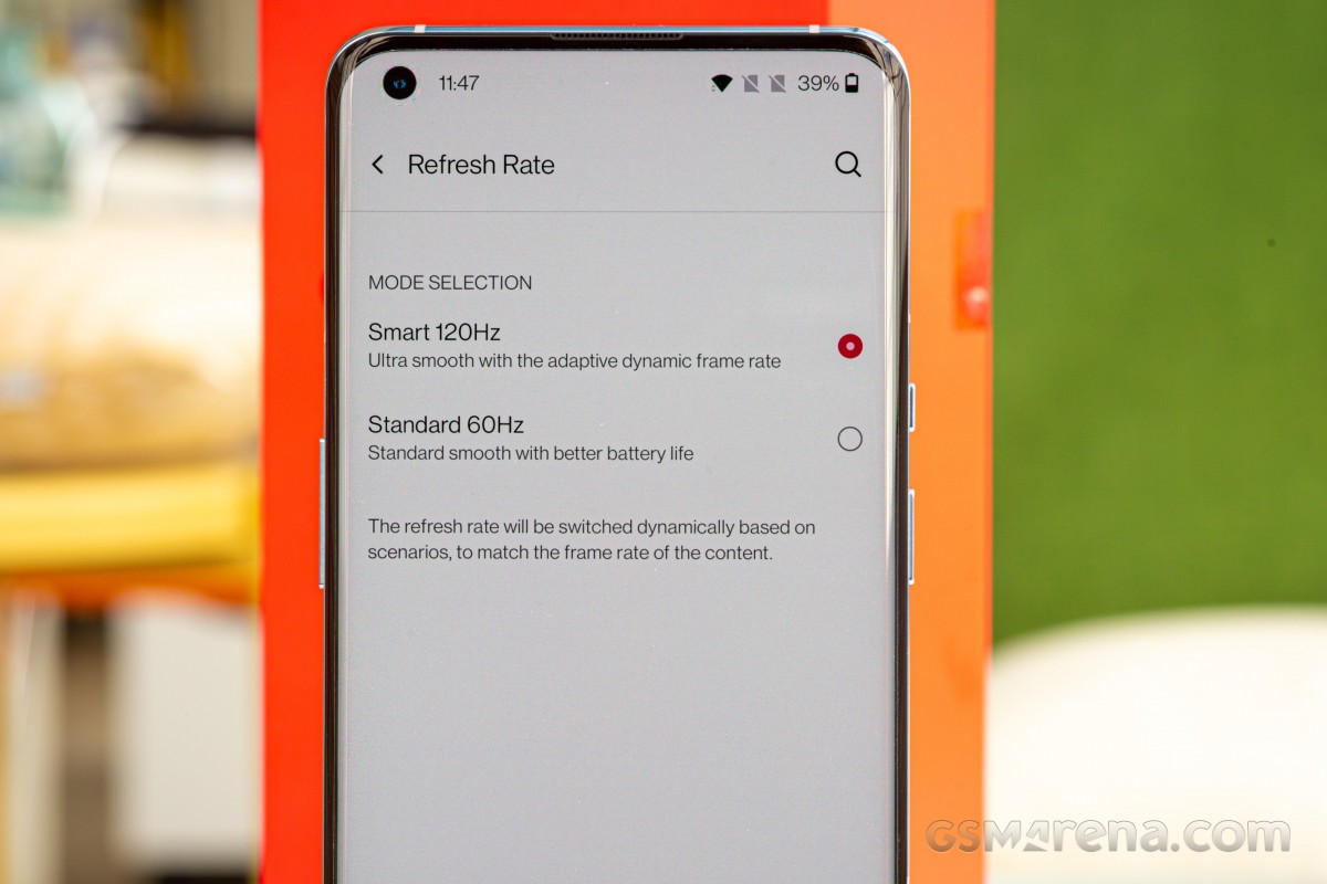
The variable refresh rate is an interesting topic. The display on the 9 Pro (not the vanilla) uses a new LTPO (low-temperature polycrystalline oxide) backplane in the panel that can dynamically adjust the display's refresh rate and scales power. If you're watching a 24fps video, the display will refresh at 24Hz and can go as low as 1 Hz when viewing a still image on screen. Once you touch the screen and start swiping around, the rate kicks back up to 120Hz.

OnePlus advertises a maximum figure of 120Hz but the display also supports intermediate values like 90Hz, 60Hz, and supposedly even 1Hz, and can adjust based on the content. When set to the 120Hz mode, the device will be constantly adjusting the refresh rate, and there's no easy way for the user to just lock it to 120Hz.

Unfortunately, we were unable to verify OnePlus' claims of 1Hz refresh rate mode. With the tools we have at our disposal, we are unable to confirm or deny that the display is doing this. Our skepticism reflects later in this page, in the battery endurance section.
OnePlus 9 Pro review

Perhaps more frustrating is OnePlus' continued lack of support for high refresh rate gaming. The company has whitelisted a very small number of games, such as Fortnite, PUBG Mobile, Pokemon Go, etc., and these are the only titles allowed to run at a maximum of 90Hz. This leaves a vast majority of games unsupported and there are also no titles that run above 90Hz. Moreover, OnePlus will also drop down the refresh rate of the display from 90Hz to 60Hz in supported games when the player stops interacting, which causes a jarring drop in fluidity because, unlike static UI screens, games tend to have moving elements on-screen animating at the display's refresh rate.

OnePlus has also added a feature they call Hyper Touch, which boosts the touch sampling rate to 360Hz. While the feature has to be manually enabled from the display settings, it currently only works in select games, including PUBG Mobile, Call of Duty Mobile, League of Legends: Wild Rift, and Brawl Stars. We played Call of Duty Mobile with the Hyper Touch mode enabled and didn't notice any improvement in the touch response. This shouldn't be surprising as increased sampling rate can only do so much and if your game is still running at 60Hz, you're not going to notice much of a difference.

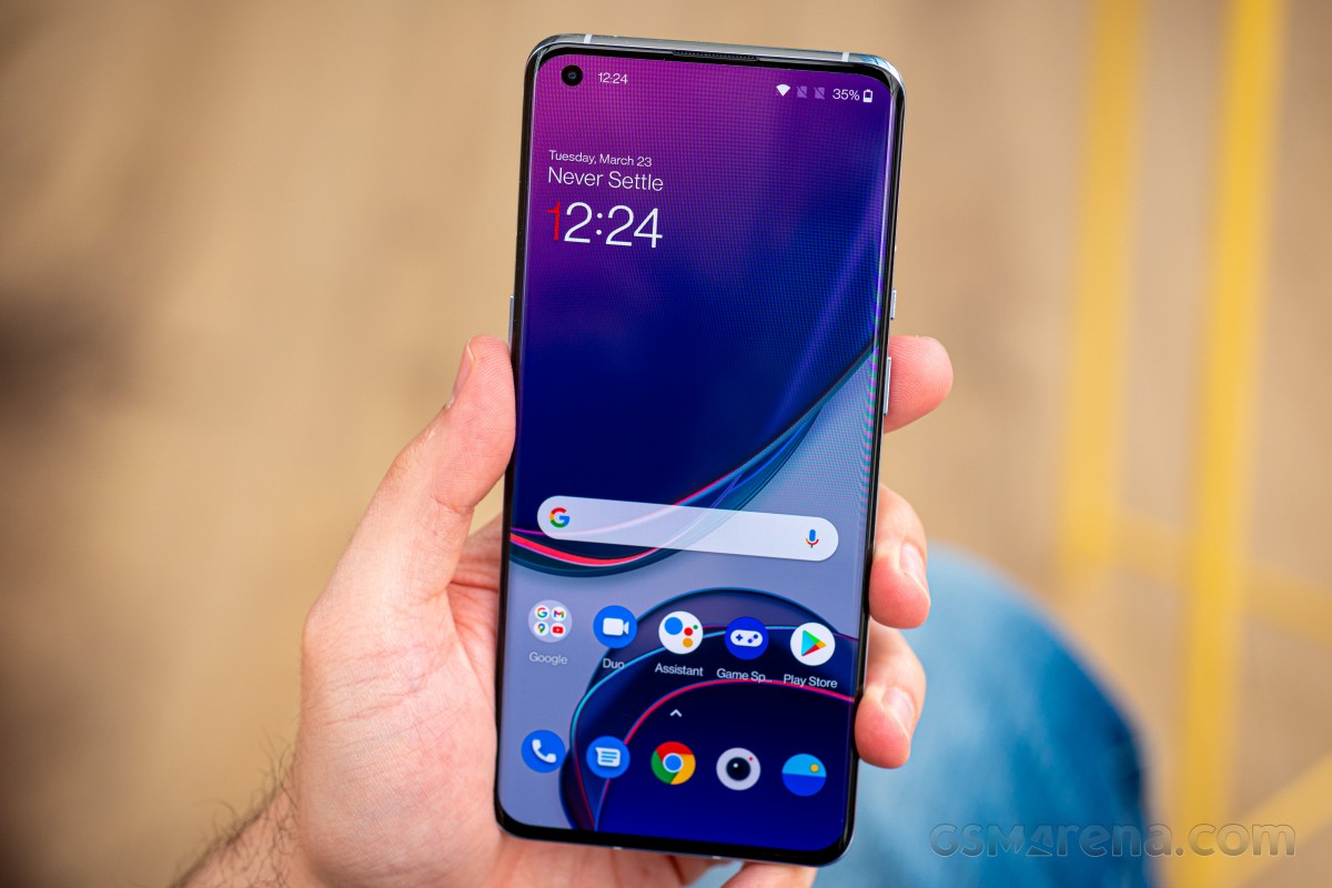
There's also a new Ultra-high video resolution mode, which at the time of testing was only available for Instagram. This feature uses AI to add edge enhancement to videos within supported apps. Tested videos on Instagram had more pronounced detail but it does tend to look a bit artificial.
OnePlus 9 Pro review

The OnePlus 9 Pro also has the Vibrant Color Effect Pro mode from the OnePlus 8 Pro, which is intended to make videos appear more saturated. However, the feature seems to do absolutely nothing on the OnePlus 9 Pro. On the OnePlus 8 Pro, enabling it would make all supported video apps appear strongly saturated. On the OnePlus 9 Pro, none of the apps we tried had any difference at all when the feature was enabled. We had first observed this on the OnePlus 8T and we are not quite sure what purpose this feature serves anymore.

The OnePlus 9 Pro also supports the Motion graphics smoothing feature found on previous models, which uses a motion compensation algorithm for frame interpolation. The purpose of this feature is to make low frame rate videos appear as if they are high frame rate. In our opinion, this feature does more harm than good, especially when used on cinematic content, which is intended to be viewed at a certain frame rate as that's part of its aesthetic. By increasing the frame rate, the video tends to appear unnaturally smooth, which ruins the creator's intent. Moreover, no motion compensation algorithm is perfect, so you'll still see plenty of motion artifacts, which further destroys the image quality. We strongly advise leaving this feature disabled.

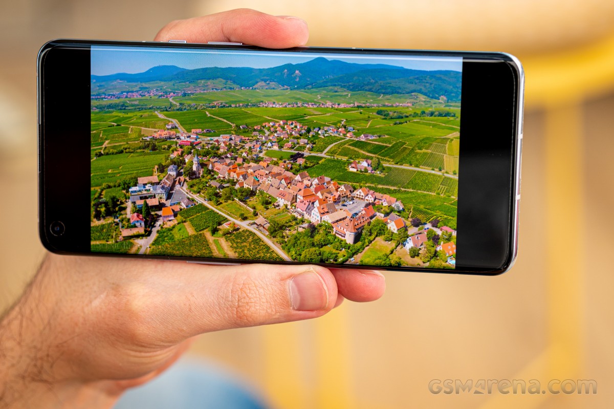
The OnePlus 9 Pro display has great HDR performance. We tested some HDR10 content in the YouTube and Netflix apps and noted improved overall brightness over the OnePlus 8 Pro. The specular highlights can get much brighter on the newer model, which produces a more impactful HDR experience. The OnePlus 9 Pro display can also reproduce detail in the shadows better before clipping to black. Being a 10-bit display with full coverage of the Display-P3 color space also means you are seeing the full breadth of colors that HDR content can have.
OnePlus 9 Pro review

The OnePlus 9 Pro display does have an issue that the 8 Pro display doesn't. While the 8 Pro display can get pitch black, the 9 Pro display can only get a dark shade of gray. This isn't noticeable in normal ambient lighting but is quite obvious when watching in a perfectly dark room and while watching content with a lot of dark scenes in it. This issue only pertains to HDR playback and not present in SDR mode.

Like we mentioned in the design section, we're glad to see that the curvature of the edges of the glass were dialed back this time around. OnePlus has opted for a less aggressively curved display this time around. Compared to the OnePlus 8 Pro, the OnePlus 9 Pro display has much less vignetting around the edges, although it's not completely gone. The new display also catches less glare around the edges than the older one.

The 9 Pro display has fewer issues with accidental touches but it's still present. This means there will still be times where you can trigger the touchscreen simply by holding the phone. This happens most commonly while using the camera when you're holding the phone by its edges. If Android manufacturers are going to insist on having curved displays, the least they could do is also implement better palm rejection.

Battery life 

The OnePlus 9 Pro uses dual 2,250mAh cells that equate to a total battery capacity of 4,500mAh. It's roughly the same capacity as the OnePlus 8 Pro that came before it. Despite the Qualcomm Snapdragon 888 platform, LTPO display, and OnePlus claims of better battery life, the OnePlus 9 Pro's battery performance was only average this time around.
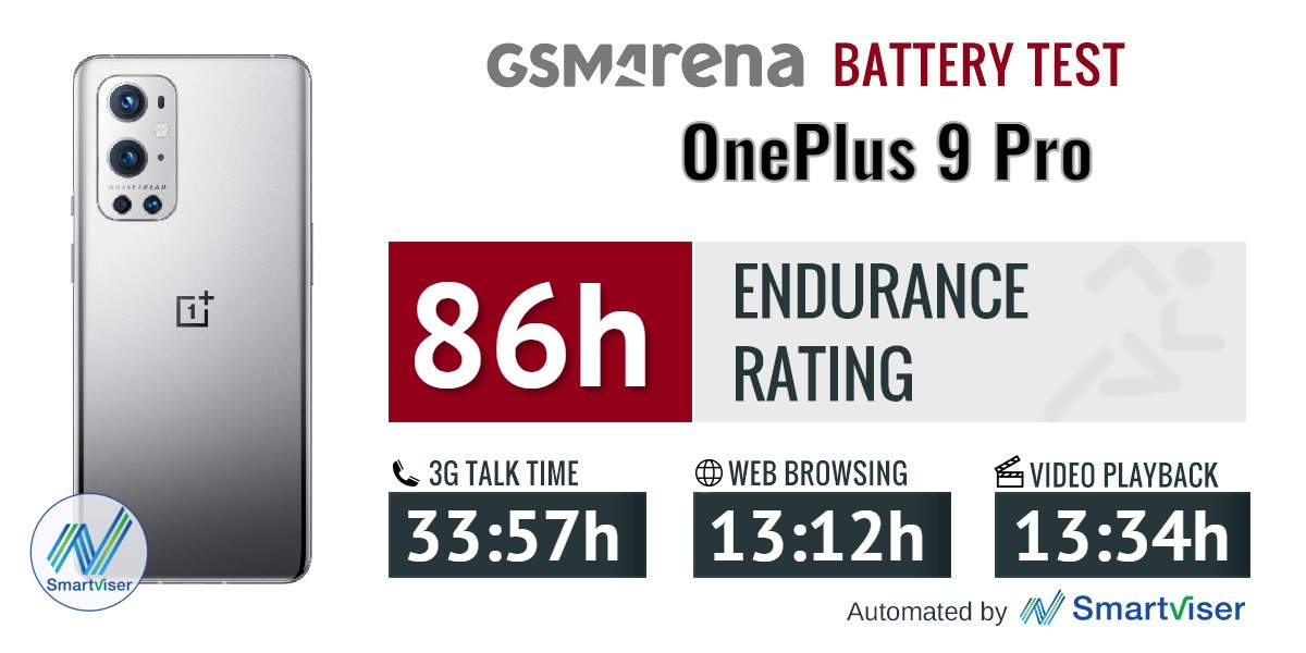
OnePlus 9 Pro review

We saw a higher 3G talk time score that totaled 33:57h. The web test did get a bump up in endurance at 13:12h, but video playback took a large hit that resulted in just 13:34. This, accompanied by the Snapdragon 888's poor standby score resulted in a significant slip in overall endurance compared to its antecedent. In reference with the other 888-powered phones, the OnePlus 9 falls right behind the Xiaomi MI 11 (score 89h) and ahead of the Oppo Find X3 Pro (score 81h).

We were under the impression that we'd see better scores in the screen-on tests than what we saw with the OnePlus 8 Pro, we are wondering whether the LPTO panel is working as advertised. Unfortunately, we are unable to confirm or deny this, as the FPS counter that's built into the Android Developer tools is not yet compatible with the LPTO tech.

Our battery tests were automated thanks to SmartViser, using its viSerDevice app. The endurance rating above denotes how long a single battery charge will last you if you use the OnePlus 9 Pro for an hour each of telephony, web browsing, and video playback daily. We've established this usage pattern so that our battery results are comparable across devices in the most common day-to-day tasks. The battery testing procedure is described in detail in case you're interested in the nitty-gritty. You can check out our complete battery test table, where you can see how all of the smartphones we've tested will compare under your own typical use.

Charging

The 4,500 mAh battery on the 8T, 9, and 9 Pro all use identical dual-cell battery tech. This means that the adapter is simultaneously fast-charging two batteries that work as one. OnePlus debuted 65W charging with the OnePlus 8T, but the 9 Pro gets a bump up in charging speed with Warp Charge 65T. The 9 and 9 Pro received improvement that "reduces internal charging resistance", according to the company, so the battery can receive high wattage for a longer time before dialing its voltage back down.

30min charging test (from 0%)

Time to full charge (from 0%)

With Warp Charge 65T, the 9 Pro's battery was fully replenished in 31 minutes, 2 minutes short of OnePlus' promised 29 minutes. The OnePlus 8T can fully recharge in 39 minutes so the improvement is marginal, but still impressive.
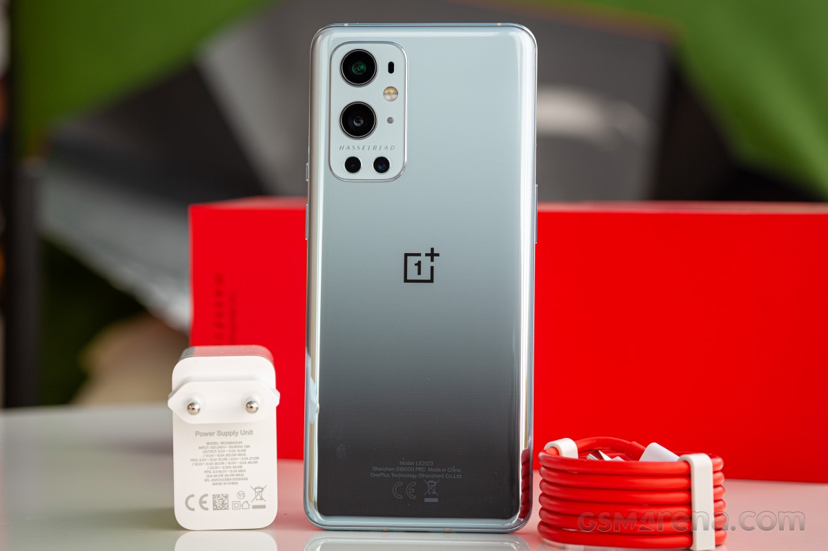
OnePlus 9 Pro review

Wireless charging sees a significant update with the 9 Pro. The company debuts a faster Warp Charge 50 Wireless Charger that delivers 50W of peak power to the phone. This comes as an update to the Warp Charge 30 Wireless Charger that launched with the 8 Pro. That charger didn't have a removable charging cable so it made it more difficult to replace the charging cable without buying a whole new charger. It also made cable management more difficult.

This time around, the Warp Charge 50 does not have a permanent wire on it. Instead, it requires that you use the Warp Charge 65T charger brick that comes included with the 9 Pro. Though it doesn't include an adapter, the wireless charger comes with its own USB-C to C cable.
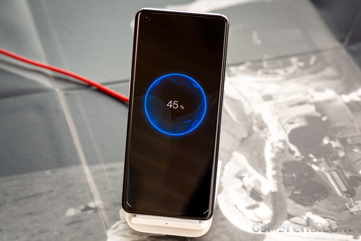
OnePlus 9 Pro review

The Warp Charge 50 Wireless dock promises a full charge in 43 minutes. In our 30 minute charge test, we achieved a 70% charge.

The Warp Charge 50 dock has dual charging coils. This is so you can drop the 9 Pro onto the Warp Charge 50 Wireless charger either upright or on its side. The charger has two coils: one on the lower part of the charger and one higher up. This way, you can recharge the 9 Pro or any Qi-compatible phone upright or on its side.

The OnePlus 9 Pro also supports reverse wireless charging, which can recharge other Qi-enabled devices at up to 5W.

Speaker test

The OnePlus 9 Pro has a stereo speaker setup with a dedicated loudspeaker on the bottom of the phone and the earpiece serving as the second channel. In portrait, the earpiece get the left channel, while in landscape the phone uses the accelerometer to switch the channels to match the orientation.

The OnePlus 9 Pro earned a 'Very Good' rating for loudness in our test, essentially the same result as the OnePlus 9, though with a marginal edge when it comes to the numbers.

Use the Playback controls to listen to the phone sample recordings (best use headphones). We measure the average loudness of the speakers in LUFS. A lower absolute value means a louder sound. A look at the frequency response chart will tell you how far off the ideal "0db" flat line is the reproduction of the bass, treble, and mid frequencies. You can add more phones to compare how they differ. The scores and ratings are not comparable with our older loudspeaker test. Learn more about how we test here.

OxygenOS

OnePlus' OxygenOS has come a long way. With version 11, the UI was tweaked with one-handed usage of a large display in mind. Many of the built-in apps and settings screens are designed with controls, tabs and buttons in the middle and lower portions of the screen to make them easier to reach one-handedly.

One new feature debuting with Oxygen OS on the 9 Pro takes place in the background. Turbo Boost 3.0 combines both RAM compression and Virtual RAM to let you keep up to 25% more apps open in the background. Virtual RAM reserves a small chunk of storage to temporarily be used as RAM when the main modules are at capacity.
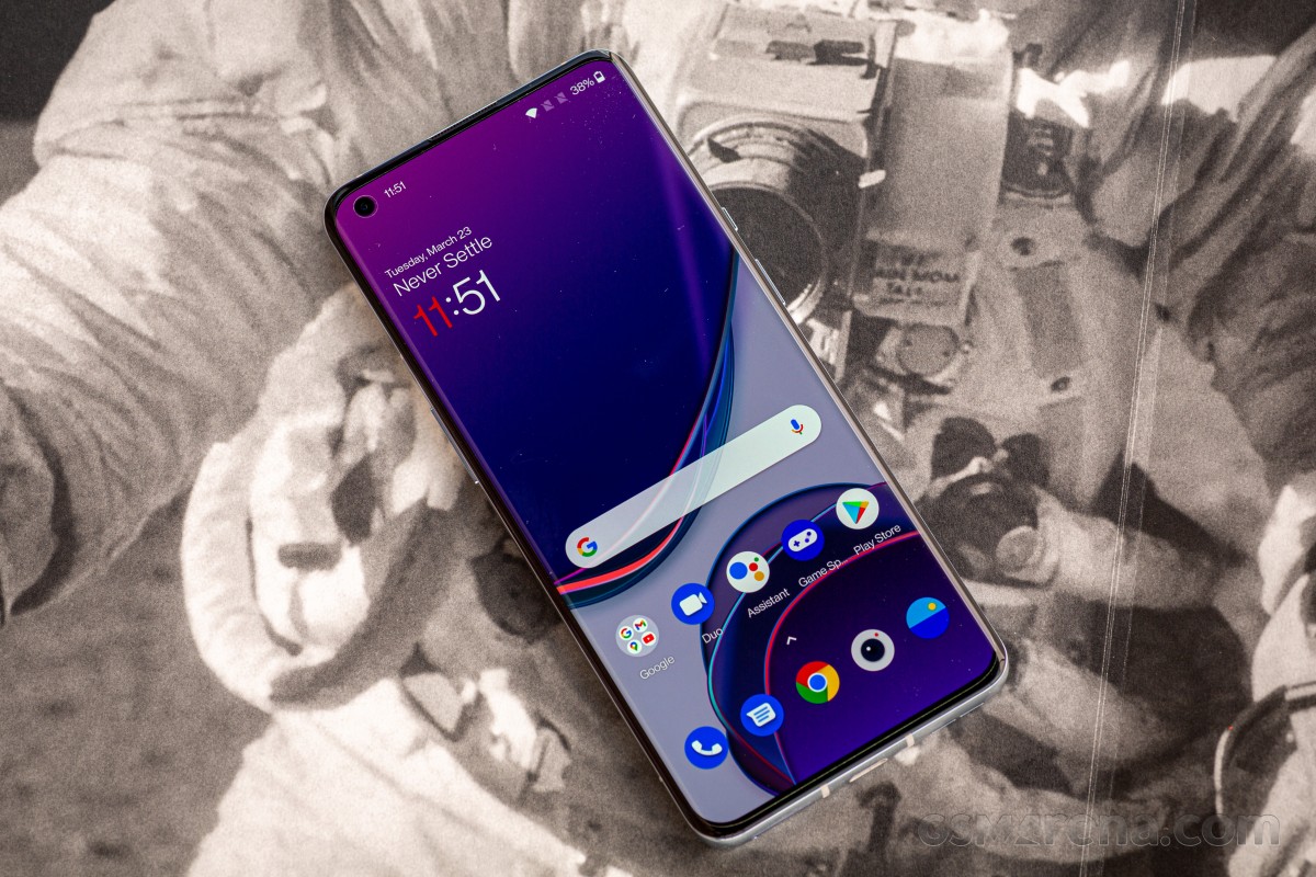
OnePlus 9 Pro review

We covered many of the changes made on OxygenOS 11 in our OnePlus 8T review. The 9 Pro arrives with this same version of the OS so we'll just brush over the basics.

During setup, you'll be asked to choose between the default "Roboto" font and "OnePlus Sans". The latter is a light font with a modern look, but some may prefer the former for its superior legibility. You can change this later in the "Customization" tab under Settings.

Font choices - OnePlus 9 Pro reviewFont choices - OnePlus 9 Pro review
Font choices

The fingerprint scanner is significantly lower on the display, but that doesn't really interfere much with its usability. At most, it may take a couple of days to get used to its new location if you're coming from another OnePlus device.

Fingerprint setup - OnePlus 9 Pro reviewFingerprint setup - OnePlus 9 Pro reviewFingerprint setup - OnePlus 9 Pro review
Fingerprint setup

With Oxygen OS 10.5, OnePlus moved the "OnePlus Shelf" from the left of the home screens to a secondary shade that's pulled down. The Google Feed now lives on the leftmost home screen. The home screen grids can be adjusted in the home screen settings - the default grid is 5x5. Icons can be switched from the default round appearance to square ones as seen on Hydrogen OS, the Chinese counterpart to Oxygen OS. In more recent developments, OnePlus announced that new OnePlus devices in China will launch with a customized variant of Oppo's Color OS Android skin.

Home screen - OnePlus 9 Pro reviewGoogle Feed - OnePlus 9 Pro reviewGrid setting - OnePlus 9 Pro reviewIcons - OnePlus 9 Pro review
Home screen • Google Feed • Grid setting • Icons

The notification shade features six Quick Settings at the top, a brightness slider, and media controls if they are available. Below this top cluster is where notifications (both audible and silent) will populate. There are even more Quick Settings available to add and rearrange.

Notification shade - OnePlus 9 Pro reviewQuick Settings - OnePlus 9 Pro reviewMore Quick Settings - OnePlus 9 Pro reviewMedia Controls - OnePlus 9 Pro reviewMedia Controls - OnePlus 9 Pro review
Notification shade • Quick Settings • More Quick Settings • Media Controls

The other pull-down drawer is the OnePlus Shelf. To access it, you swipe down on any area of the OxygenOS launcher's home screens. The notification shade is accessed by swiping down from the very top.

The Shelf can be customized with preloaded tools like a step counter, weather widget, and a parking widget. Additional third-party widgets can be added here as well. Think of this as a customizable place for your favorite shortcuts and widgets that won't take up space on any of the home screens.

OnePlus shelf - OnePlus 9 Pro reviewOnePlus shelf - OnePlus 9 Pro review
OnePlus shelf

The settings for the Ambient Display are all in the "Customization" tab in the Settings app. Here you can change the accent color, system icons, wallpapers, font, and the Ambient Display clock.

Insight is the Ambient clock that also offers a glimpse as your phone's usage, showing you how often you unlock the screen throughout the day.

Customization: main screen - OnePlus 9 Pro reviewCustomization: accent - OnePlus 9 Pro reviewCustomization: tile shape - OnePlus 9 Pro reviewCustomization: Ambient clock - OnePlus 9 Pro reviewCustomization: Insight - OnePlus 9 Pro reviewCustomization: Insight - OnePlus 9 Pro review
Customization: main screen • accent • tile shape • Ambient clock • Insight

OxygenOS 11 is great on the 9 Pro. It's not quite as bone-stock as it used to be, but it looks and flows well. OnePlus has managed to add plenty of function and features without bogging down the overall user-experience, all while keeping the interface clean. Settings aren't perfectly organized, but that's true of many Android skins these days.

There is still no dedicated one-handed mode in OxygenOS 11, though this is a feature that's evidently coming to the next major Android release.

Synthetic benchmarks

The OnePlus 9 and 9 Pro are the first few devices that arrive to market with Qualcomm's latest mobile chipset built on the 5nm fabrication process. The Snapdragon 888 Mobile Platform powers both devices with an embedded X60 5G modem.

The Snapdragon 888 is an eight-core processor made up to three clusters that outperforms the Snapdragon 865 by up to 25%. The top cluster is a single 2.84GHz Kryo 680 Prime using ARM's Cortex-X1 design. Then there's a triple-core cluster made up of three Kryo 680 Gold cores @ 2.42GHz based on Cortex-A78. Finally, there's a quad-core cluster of efficient and low-power Kryo 680 Silver cores clocked at 1.8GHz.
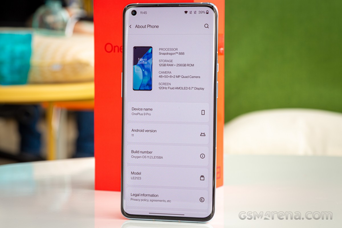
OnePlus 9 Pro review

Powering graphics is the Adreno 660 GPU that promises a 35% increase of performance over the Adreno 650. It supports Open GL ES 3.2, Vulcan 1.1, and a new variable rate shading technology.

Both the OnePlus 9 and 9 Pro come with LPDDR5 RAM that the company claims can run at speeds of up to 6,400 Mbps. The phones are using UFS 3.1 storage (non-expandable).

Only the OnePlus 9 Pro supports Hyper Touch. This is a feature that taps into faster responsiveness when playing competitive games. The display typically synchronizes at 60Hz-120Hz but with Hyper Touch enabled, the speed is 360Hz. Only four mobile gaming titles currently support the feature:  PUBG Mobile, Call of Duty Mobile, League of Legends, and Brawl Stars.
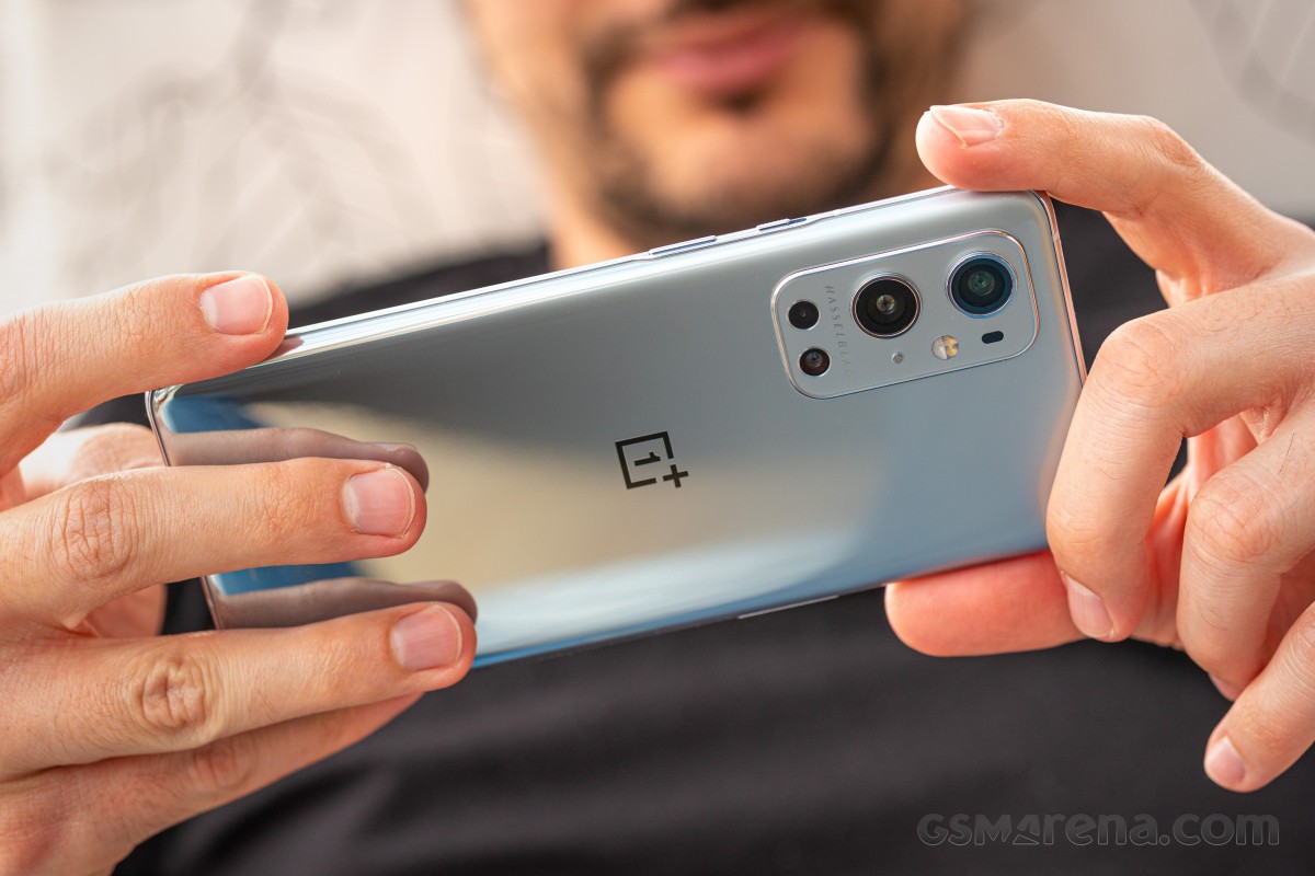
OnePlus 9 Pro review

Cool Play is another feature that's on both the 9 and 9 Pro. It introduces larger materials in the phones' thermal systems including thicker graphite sheets, larger copper foil, and a larger vapor chamber. The latter helps to divert heat generated from playing games into the frame where it can be dissipated from the phone's panes of glass. After a match of PUBG, the phone was significantly warm, but the heat was distributed all over the phone's body.

Let's get into the benchmarks!

In the first benchmark, the OnePlus 9 Pro kept up with the ROG Phone 5, though it fell just barely behind. It still scored negligibly ahead of the Exynos 2100-powered Samsung Galaxy S21 Ultra, the 888-powered Xiaomi Mi 11, and the Oppo Find X3 Pro. The 9 Pro was slightly bested by the Huawei Mate 40 Pro, albeit only with that phone's "Performance mode" enabled.

Single-core scores are nearly uniform across all the recent flagships. Apple still leads the charts with its A14 Bionic chip in both single and multi-core tests.

GeekBench 5 (multi-core)

Higher is better

GeekBench 5 (single-core)

Higher is better

The 9 Pro's graphics performance is quite great. The ASUS ROG Phone 5 was able to squeeze a few more frames out but the difference is negligible. The ROG Phone 5 has active cooling work in its favor, though. GPU performance is right in line with the other Snapdragon 888 performers from Xiaomi and Oppo.

GFX Manhattan ES 3.1 (offscreen 1080p)

Higher is better

GFX Car Chase ES 3.1 (offscreen 1080p)

Higher is better

The onscreen tests scored in favor of those devices that have screens with Full HD+ resolution.

GFX Manhattan ES 3.1 (onscreen)

Higher is better

GFX Car Chase ES 3.1 (onscreen)

Higher is better

3DMark Wild Life Vulkan 1.1 (offscreen 1440p)

Higher is better

The 9 Pro performed well in the Antutu run, though it fell behind both the Asus ROG Phone 5 and the OnePlus 9. Still ahead of the Huawei Mate 40 Pro and the other devices powered by the same chipset.

AnTuTu 8

Higher is better

There's no room for complaints on the OnePlus 9 Pro's performance. It handled a long PUBG session beautifully, with all in-game graphic settings maxed out.

The phone did get significantly warm so we don't anticipate that the "Cool Play" feature will live up to its name in every situation. Cool Play, however, was certainly working as advertised because heat was being actively distributed throughout the phone's surfaces and didn't hang around one hot spot.

We ran the 3D Mark Wild Life Stress test and the OnePlus 9 Pro scored 55.6% stability with the display settings maxed out to QHD+ and with Smart 120Hz enabled. Frame rates steadily fell after the fourth or fifth loop run but didn't begin to really drop until the 9th loop. Frame rates bottomed out on the 19th loop.

Introduction

The OnePlus 9 Pro has a quad-camera system on the back, consisting of a wide, ultra-wide, telephoto, and monochrome camera.

The main wide camera has a new Sony IMX789 sensor with a 48-megapixel resolution and 23mm equivalent f1.8 7P lens with OIS. It has dual native ISO, supports 12-bit RAW output, and Sony's DOL-HDR technique. The ultra-wide camera uses a new Sony IMX766 sensor with a 50-megapixel resolution and 14mm equivalent f2.2 7P freeform lens.
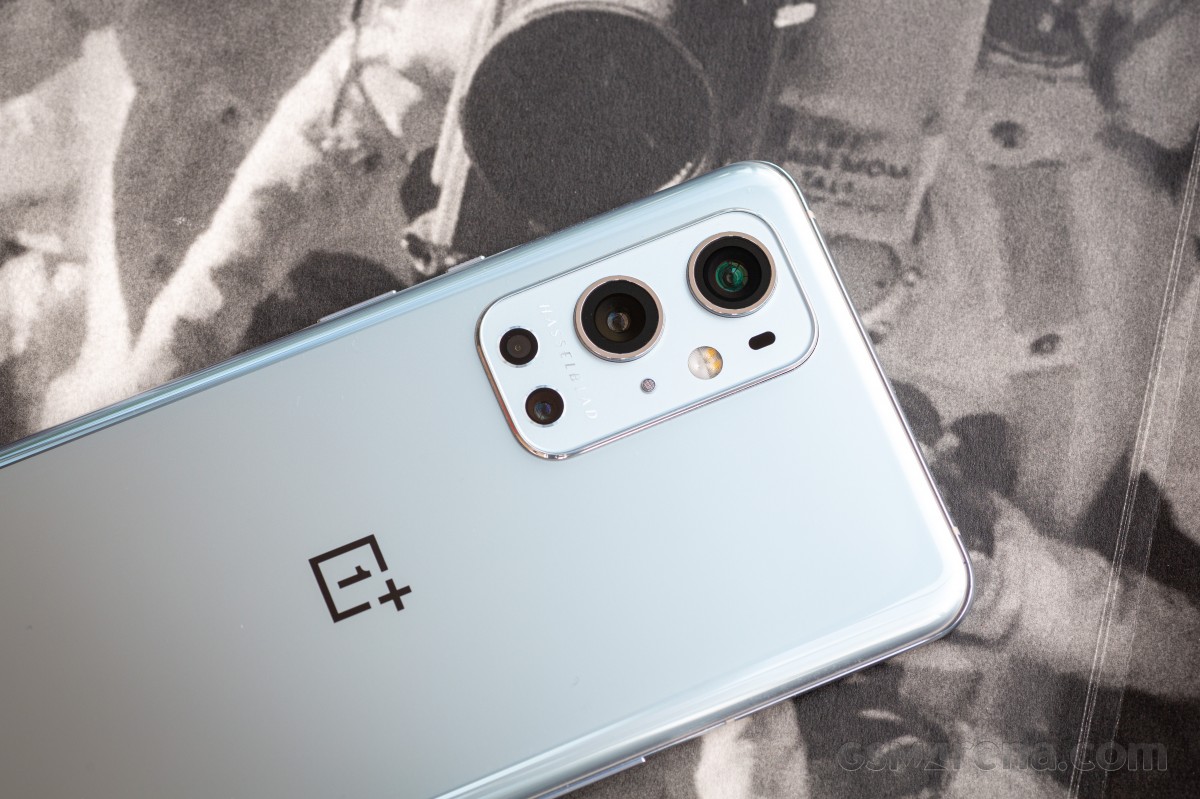
OnePlus 9 Pro review

The telephoto camera has an 8-megapixel sensor with an f2.4 aperture with a 3.3x magnification factor over the main lens. Unlike previous models, the telephoto camera is not used for portrait mode images but just for zoomed images and videos. Finally, the monochrome camera has a 2-megapixel resolution and only exists to assist the main camera in producing monochrome images.

With the OnePlus 9 Pro, the company has partnered with Swedish-camera manufacturer Hasselblad for a three-year period. Hasselblad is said to have contributed to the color calibration on the OnePlus 9 series as well as the redesigned camera interface.

Camera app

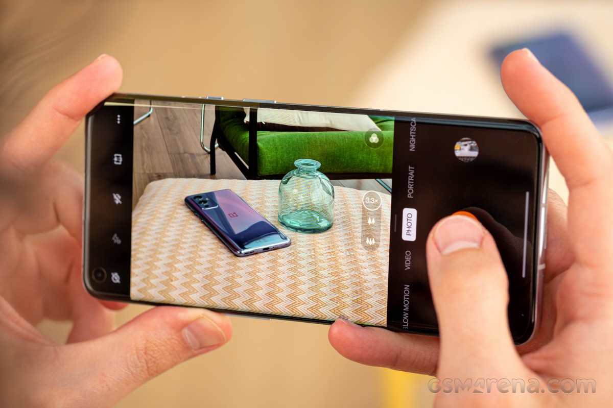
Let's start with that interface first. The OnePlus 9 Pro comes with a new camera app, which features some notable changes and improvements over the app found on previous-generation models. The most striking change is the use of a new camera shutter button, with OnePlus opting for the distinctive orange color as seen on the shutter buttons on Hasselblad cameras. The shutter sound has also been changed to match Hasselblad cameras.

Camera app - OnePlus 9 Pro reviewCamera app - OnePlus 9 Pro reviewCamera app - OnePlus 9 Pro reviewCamera app - OnePlus 9 Pro reviewCamera app - OnePlus 9 Pro reviewCamera app - OnePlus 9 Pro review
Camera app

To see the bulk of the changes in the camera app, we need to switch over to the Pro mode. Here, we find the updated UI for the adjustment dials for parameters such as ISO, white balance, shutter speed, exposure compensation, and focus. Instead of the rotating wheel in the previous app, the OnePlus 9 Pro has a straightforward horizontal bar that can be swiped up and down. This is much easier to adjust than the rotating wheel of before and the auto mode switch is always visible rather than being at some arbitrary point on the wheel that you have to spin to.
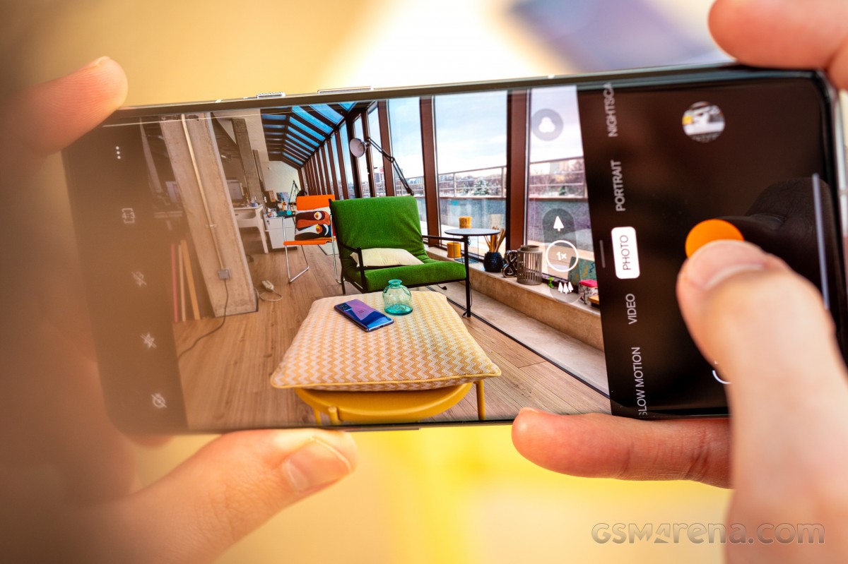
OnePlus 9 Pro review

Unfortunately, that's pretty much the extent of the improvements in the camera UI. There are still some issues, which we would have liked OnePlus to have fixed by now. Manually adjusting the exposure in Auto mode is still a nightmare, with a tiny slider that's hard to adjust and an even tinier icon to lock it. The zoom control dial is still annoyingly finicky and getting an exact figure dialed in is a test of patience. This would have been a good time to replace with a vertical slider like for the settings in Pro mode, but that hasn't happened.

Camera app - OnePlus 9 Pro reviewCamera app - OnePlus 9 Pro reviewCamera app - OnePlus 9 Pro reviewCamera app - OnePlus 9 Pro reviewCamera app - OnePlus 9 Pro review
Camera app

The UI also doesn't rotate when held in landscape. Trying to quickly open the settings menu while in landscape mode is a laughably bad experience, as the screen stays resolutely in portrait mode, even if you have auto-rotate enabled, forcing you to turn the phone around. The settings icon is also quite small and difficult to press.
OnePlus 9 Pro review

OnePlus has also added a new transition animation when switching between the three lenses instead of just switching the viewfinder instantly like on previous models. This is easily the jankiest transition we have seen on any smartphone and switching from ultra-wide to telephoto almost looks like stop-motion animation.

The camera app also has a bug in OxygenOS 11.2.1.1, where enabling 60fps or 120fps mode would cause the viewfinder to often be stuck in 30fps mode. The actual recorded video is in the correct frame rate but the viewfinder isn't.

Lastly, the Pro mode still doesn't allow you to access any other camera. This means you are strictly limited to the main wide camera on the back if you want full control or the ability to shoot in RAW. There's also no Pro mode available for video or an option to record in 24fps.

Daylight performance

Let's start with the daylight image quality of the main camera. The results here are good but also underwhelming when you consider the focus on the camera and the Hasselblad partnership with this year's models.

Starting with the detail, the OnePlus 9 Pro offers very little meaningful improvement over its predecessors. The level of detail is good but also typical of 12-megapixel sensors and lags behind the higher resolution sensors on some of the competing devices. Fine detail is still somewhat fuzzy at times and textures tend to get smeared on surfaces with low-frequency detail.

Daylight 12MP samples - f/1.9, ISO 125, 1/4059s - OnePlus 9 Pro reviewDaylight 12MP samples - f/1.9, ISO 125, 1/4306s - OnePlus 9 Pro reviewDaylight 12MP samples - f/1.9, ISO 250, 1/10520s - OnePlus 9 Pro reviewDaylight 12MP samples - f/1.9, ISO 125, 1/3999s - OnePlus 9 Pro review
Daylight 12MP samples - f/1.9, ISO 100, 1/2281s - OnePlus 9 Pro reviewDaylight 12MP samples - f/1.9, ISO 250, 1/7538s - OnePlus 9 Pro reviewDaylight 12MP samples - f/1.9, ISO 125, 1/3769s - OnePlus 9 Pro reviewDaylight 12MP samples - f/1.9, ISO 250, 1/2598s - OnePlus 9 Pro review
Daylight 12MP samples - f/1.9, ISO 125, 1/2562s - OnePlus 9 Pro reviewDaylight 12MP samples - f/1.9, ISO 125, 1/3065s - OnePlus 9 Pro reviewDaylight 12MP samples - f/1.9, ISO 125, 1/3687s - OnePlus 9 Pro reviewDaylight 12MP samples - f/1.9, ISO 125, 1/1530s - OnePlus 9 Pro review
Daylight 12MP samples

The level of detail is also a bit lower than what we saw on the OnePlus 8 Pro. It's possible the culprit for that is the switch to a slightly wider focal length, which now fits more in the frame at the same resolution, thus making everything in the frame just a little bit fuzzier. OnePlus has dialed up the sharpening on the OnePlus 9 Pro to compensate for this but sharpening cannot add missing detail and only ends up adding haloing artifacts.

OnePlus 8 Pro - f/1.8, ISO 125, 1/6695s - OnePlus 9 Pro reviewOnePlus 9 Pro - f/1.9, ISO 125, 1/4059s - OnePlus 9 Pro reviewOnePlus 8 Pro - f/1.8, ISO 125, 1/3652s - OnePlus 9 Pro reviewOnePlus 9 Pro - f/1.9, ISO 125, 1/3065s - OnePlus 9 Pro review
OnePlus 8 Pro • OnePlus 9 Pro • OnePlus 8 Pro • OnePlus 9 Pro

The full 48-megapixel resolution mode also doesn't help much in this regard. You don't actually get any additional detail and resizing the images back down to 12-megapixel reveals that they are nearly identical to the standard 12-megapixel images, minus some of the noise and aggressive sharpening.

Daylight 48MP samples - f/1.9, ISO 100, 1/2611s - OnePlus 9 Pro reviewDaylight 48MP samples - f/1.9, ISO 250, 1/5367s - OnePlus 9 Pro reviewDaylight 48MP samples - f/1.9, ISO 100, 1/2896s - OnePlus 9 Pro reviewDaylight 48MP samples - f/1.9, ISO 100, 1/2730s - OnePlus 9 Pro review
Daylight 48MP samples

Speaking of noise, the default 12-megapixel images were often surprisingly noisy even when shooting in broad daylight at the lowest ISO. The noise won't be visible when looking at the images on your phone's screen but would become noticeable if you start editing the images or if crop into it. In comparison, the OnePlus 8 Pro images had surprisingly low noise, despite having similar or even greater detail. The higher sharpening on the OnePlus 9 Pro also doesn't do it any favors as the noise in the images also tends to get accentuated by it.

The color performance is also a mixed bag. We had high hopes in this area, especially since OnePlus promised more natural color reproduction, but the OnePlus 9 Pro images aren't exactly natural. Daylight images can often have deeply saturated skies and bold green foliage, which is much more vibrant than in the actual scene. The white balance has a tendency to be on the cooler side while shooting in sunny conditions. Reds will occasionally shift towards magenta, especially in indoor lighting. The contrast also tends to be jacked up significantly at times, often to the detriment of the image.

Compared to its predecessor, the OnePlus 9 Pro occasionally performed worse. The OnePlus 8 Pro often had a more correct white balance and more balanced, less contrasty images.

Dynamic range is average. While the OnePlus 8 Pro had a tendency to overexpose, the OnePlus 9 Pro tends to underexpose, which can cause images to have less detail in the shadows. OnePlus' UltraShot HDR can still have that fake, aggressive tone-mapped HDR look to it at times, especially when shooting indoors, and the images from auto mode don't look as natural as those from Apple or Google smartphones.

The actual sensor on the OnePlus 9 Pro is leagues ahead of its predecessor. The IMX789 handily outperforms the IMX689 in dynamic range and low light performance. Trying to compare RAW images captured on both phones, the files on the OnePlus 9 Pro can be pushed much further in post and shadows remain clean even after +3 exposure thanks to the dual native ISO whereas the OnePlus 8 Pro images start falling apart when pushed similarly. The level of detail in the RAW files is also impressive.

It's clear then that the issue lies with OnePlus - and now Hasselblad's - tuning of the default JPEGs. If you don't mind getting your hands dirty, you can get so much more value out of this camera by shooting in RAW and processing the images yourself as the actual hardware in here is absolutely top-notch. Even the JPEG files from the Pro mode are generally superior to Auto mode, as they have less sharpening, noise, and more natural contrast.

The new ultra-wide camera on the OnePlus 9 Pro is impressive, as far as ultra-wide cameras go. The color performance is similar to the main camera but despite the incredibly wide perspective, the level of detail from the 12.5-megapixel images is really quite good.

Daylight 12.5MP ultra-wide samples - f/2.2, ISO 125, 1/2026s - OnePlus 9 Pro reviewDaylight 12.5MP ultra-wide samples - f/2.2, ISO 100, 1/3300s - OnePlus 9 Pro reviewDaylight 12.5MP ultra-wide samples - f/2.2, ISO 125, 1/2723s - OnePlus 9 Pro reviewDaylight 12.5MP ultra-wide samples - f/2.2, ISO 125, 1/7135s - OnePlus 9 Pro review
Daylight 12.5MP ultra-wide samples - f/2.2, ISO 125, 1/1263s - OnePlus 9 Pro reviewDaylight 12.5MP ultra-wide samples - f/2.2, ISO 125, 1/1109s - OnePlus 9 Pro reviewDaylight 12.5MP ultra-wide samples - f/2.2, ISO 125, 1/1105s - OnePlus 9 Pro reviewDaylight 12.5MP ultra-wide samples - f/2.2, ISO 125, 1/982s - OnePlus 9 Pro review
Daylight 12.5MP ultra-wide samples

But the main attraction here is the new freeform lens. On most other smartphones, the ultra-wide image needs to be corrected in software to remove the distortion around the edges. This is usually enabled through the camera settings and the reason this is optional is because enabling it crops the image, which reduces some of the wide perspective. This is how it's done on the OnePlus 8 Pro as well. On the OnePlus 9 Pro, there is no such option in the camera settings because the freeform lens corrects the perspective before the image even hits the sensor.

This results in images that are wider than on the previous generation model without any distortion. It's actually pretty cool and straight lines even around the edges of the frame continue to be straight without bending.
OnePlus 9 Pro review

The 3.3x telephoto performs reasonably well in good lighting. It has a good amount of detail and the default reach without further digital zoom is often sufficient for most use cases. The color performance can occasionally be hit or miss, there is some fringing seen on some shots, and the focusing performance isn't as confident or fast as on the main camera. Also, the camera will just switch to the main lens if it feels like the subject you're trying to capture with the telephoto lens is too close, which isn't ideal as 3.3x digital zoom on the main lens doesn't look that great.

Daylight 8MP 3.3x telephoto samples - f/2.4, ISO 100, 1/1882s - OnePlus 9 Pro reviewDaylight 8MP 3.3x telephoto samples - f/2.4, ISO 100, 1/2644s - OnePlus 9 Pro reviewDaylight 8MP 3.3x telephoto samples - f/2.4, ISO 100, 1/1244s - OnePlus 9 Pro reviewDaylight 8MP 3.3x telephoto samples - f/2.4, ISO 100, 1/455s - OnePlus 9 Pro review
Daylight 8MP 3.3x telephoto samples - f/2.4, ISO 125, 1/2247s - OnePlus 9 Pro reviewDaylight 8MP 3.3x telephoto samples - f/2.4, ISO 100, 1/1122s - OnePlus 9 Pro reviewDaylight 8MP 3.3x telephoto samples - f/2.4, ISO 100, 1/1360s - OnePlus 9 Pro reviewDaylight 8MP 3.3x telephoto samples - f/2.4, ISO 100, 1/2765s - OnePlus 9 Pro review
Daylight 8MP 3.3x telephoto samples

The macro camera duties on the OnePlus 9 Pro are smartly handled by the ultra-wide camera as with the previous two generation Pro models. Admittedly, the closest focusing distance of the ultra-wide lens isn't as low as some of the dedicated macro cameras on other models but that's fine as the sheer difference in image quality and level of detail that you get from this camera compared to those 2 and 5-megapixel macro cameras is staggering.

Macro samples - f/2.2, ISO 125, 1/1190s - OnePlus 9 Pro reviewMacro samples - f/2.2, ISO 125, 1/1697s - OnePlus 9 Pro reviewMacro samples - f/2.2, ISO 125, 1/2529s - OnePlus 9 Pro reviewMacro samples - f/2.2, ISO 250, 1/820s - OnePlus 9 Pro review
Macro samples

The camera has an option to switch into the macro mode if it detects you are too close to the subject. It usually kicks in when the subject gets within six inches of the camera. Occasionally, it's better to shoot in the macro mode even if you're not too close to the camera, as the large sensor and wide aperture on the main lens can cause images shot close to the lens to appear soft and blurry around the edges.

Before we move on to the night mode, we need to talk about the monochrome camera. Like the OnePlus 8T, the OnePlus 9 Pro has a 2-megapixel monochrome camera. As mentioned before, this camera doesn't capture any images by itself but rather 'assists' the main camera in taking monochrome images.

Monochrome sample - f/1.9, ISO 125, 1/4435s - OnePlus 9 Pro review
Monochrome sample

By now we are quite used to hearing a lot of silly excuses from manufacturers for having that magical fourth lens on the back of their phones to complete their marketing campaigns but this one currently takes the cake. The main camera doesn't need a second lens to assist it in capturing monochrome images. The camera can very easily do it in software, as it already does for the other two monochrome filters in the camera app. OnePlus's rationale for having this fourth sensor is laughable and the images shot have nothing special or even identifiably different about them. They just look black and white.

Low light performance

Lowlight is where the OnePlus 9 Pro camera comes into its own and starts firing on all cylinders. The two new cameras provide some of the best low-light performance on the market. And that's before you even turn on the night mode.

Low light main samples - f/1.9, ISO 8000, 1/24s - OnePlus 9 Pro reviewLow light main samples - f/1.9, ISO 1600, 1/40s - OnePlus 9 Pro reviewLow light main samples - f/1.9, ISO 3200, 1/10s - OnePlus 9 Pro reviewLow light main samples - f/1.9, ISO 320, 1/60s - OnePlus 9 Pro review
Low light main samples - f/1.9, ISO 1600, 1/20s - OnePlus 9 Pro reviewLow light main samples - f/1.9, ISO 12500, 1/30s - OnePlus 9 Pro reviewLow light main samples - f/1.9, ISO 3200, 1/15s - OnePlus 9 Pro reviewLow light main samples - f/1.9, ISO 1000, 1/15s - OnePlus 9 Pro review
Low light main samples

Starting with the main camera, you get a good amount of detail and fairly impressive color performance when shooting in standard mode, despite the fairly high ISO values. The excellent new sensor allows the camera to get cleaner images even at higher ISO values. Unless the conditions are severely dark, you can get by in most situations by never having to enable the Nightscape mode.

Low light main Nightscape samples - f/1.9, ISO 3200, 1/7s - OnePlus 9 Pro reviewLow light main Nightscape samples - f/1.9, ISO 1600, 1/12s - OnePlus 9 Pro reviewLow light main Nightscape samples - f/1.9, ISO 4000, 1/7s - OnePlus 9 Pro reviewLow light main Nightscape samples - f/1.9, ISO 500, 1/24s - OnePlus 9 Pro review
Low light main Nightscape samples - f/1.9, ISO 1600, 1/17s - OnePlus 9 Pro reviewLow light main Nightscape samples - f/1.9, ISO 3200, 1/9s - OnePlus 9 Pro reviewLow light main Nightscape samples - f/1.9, ISO 2000, 1/10s - OnePlus 9 Pro reviewLow light main Nightscape samples - f/2.2, ISO 5000, 1/10s - OnePlus 9 Pro review
Low light main Nightscape samples

Once enabled, Nightscape improves the image quality even further. The images have better exposure, dynamic range, and color. It also cleans up the noise fairly well. Focusing performance is also quite decent in Nightscape mode, except when the subject is too dark and further away than what the laser AF can reach. However, OnePlus Nightscape images can still look over processed and overexposed at times, occasionally making the scene look like it was shot at a totally different time of day. Sometimes, this isn't desirable so you may want to dial in the exposure manually.

Light light ultra-wide samples - f/2.2, ISO 8000, 1/15s - OnePlus 9 Pro reviewLight light ultra-wide samples - f/2.2, ISO 4000, 1/30s - OnePlus 9 Pro reviewLight light ultra-wide samples - f/2.2, ISO 12500, 1/15s - OnePlus 9 Pro reviewLight light ultra-wide samples - f/2.2, ISO 400, 1/30s - OnePlus 9 Pro review
Light light ultra-wide samples - f/2.2, ISO 2000, 1/10s - OnePlus 9 Pro reviewLight light ultra-wide samples - f/2.2, ISO 3200, 1/4s - OnePlus 9 Pro reviewLight light ultra-wide samples - f/2.2, ISO 1600, 1/10s - OnePlus 9 Pro reviewLight light ultra-wide samples - f/2.2, ISO 6400, 1/30s - OnePlus 9 Pro review
Light light ultra-wide samples

Light light ultra-wide Nightscape samples - f/2.2, ISO 6400, 1/6s - OnePlus 9 Pro reviewLight light ultra-wide Nightscape samples - f/2.2, ISO 2500, 1/10s - OnePlus 9 Pro reviewLight light ultra-wide Nightscape samples - f/2.2, ISO 6400, 1/5s - OnePlus 9 Pro reviewLight light ultra-wide Nightscape samples - f/2.2, ISO 1000, 1/24s - OnePlus 9 Pro review
Light light ultra-wide Nightscape samples - f/2.2, ISO 2000, 1/10s - OnePlus 9 Pro reviewLight light ultra-wide Nightscape samples - f/2.2, ISO 6400, 1/10s - OnePlus 9 Pro reviewLight light ultra-wide Nightscape samples - f/2.2, ISO 5000, 1/10s - OnePlus 9 Pro reviewLight light ultra-wide Nightscape samples - f/1.9, ISO 2000, 1/10s - OnePlus 9 Pro review
Light light ultra-wide Nightscape samples

The ultra-wide camera also has impressive low light performance compared to what we have become used to seeing on these lenses. Enabling Nightscape improves them considerably and makes them even more impressive.

Once you're done with the real world samples, head over to our Photo compare tool to see how the OnePlus 9 Pro stacks up against the competition.

Photo Compare ToolPhoto Compare ToolPhoto Compare Tool
OnePlus 9 Pro against the Galaxy S21 Ultra 5G and the Xiaomi Mi 11 in our Photo compare tool

Portraits

The OnePlus 9 Pro can shoot portrait images using only the primary lens. By default it applies a 2x digital zoom as it provides less distortion (necessary for human subjects) and also better subject isolation but you can also switch to the full field of view if you want to fit more into the frame at the cost of some stretching of your subject.

Portrait samples - f/1.9, ISO 100, 1/105s - OnePlus 9 Pro reviewPortrait samples - f/1.9, ISO 100, 1/232s - OnePlus 9 Pro reviewPortrait samples - f/1.9, ISO 125, 1/1315s - OnePlus 9 Pro review
Portrait samples - f/1.9, ISO 100, 1/3145s - OnePlus 9 Pro reviewPortrait samples - f/1.9, ISO 160, 1/100s - OnePlus 9 Pro reviewPortrait samples - f/1.9, ISO 160, 1/100s - OnePlus 9 Pro review
Portrait samples

The OnePlus 9 Pro does an okay job here. You don't get a choice in the strength of the blur effect so while it can look quite impressive at times, other times it has the effect of isolating your subject more aggressively than required, creating a cutout effect. The AI algorithm responsible for separating the subject from the background does a decent job but can get tripped by some hairstyles, glasses, and small gaps between elbows and body.

Selfies

The OnePlus 9 Pro has a 16-megapixel f2.4 fixed-focus camera. This is the same Sony IMX471 that has been the staple of OnePlus phones going back all the way to the OnePlus 7 Pro.

It's clear why OnePlus continues to rely on this sensor, as it provides a good level of detail, decent color performance, and adequate dynamic range for portrait images captured in daylight.

Selfie samples - f/2.5, ISO 125, 1/5177s - OnePlus 9 Pro reviewSelfie samples - f/2.5, ISO 125, 1/9001s - OnePlus 9 Pro reviewSelfie samples - f/2.5, ISO 125, 1/9272s - OnePlus 9 Pro reviewSelfie samples - f/2.5, ISO 100, 1/4746s - OnePlus 9 Pro review
Selfie samples

Where it falls behind is in low-light performance as there's no Nightscape for the front camera. The camera also lacks autofocus and the video resolution is limited to just 1080p60. Also, while the field of view is adequate for one person, it will feel more restrictive compared to some of the wider cameras on the market, including OnePlus's own Nord that comes with a separate ultra-wide front camera and even 4K recording.

Selfie portrait samples - f/2.5, ISO 125, 1/4574s - OnePlus 9 Pro reviewSelfie portrait samples - f/2.5, ISO 125, 1/9414s - OnePlus 9 Pro reviewSelfie portrait samples - f/2.5, ISO 125, 1/11224s - OnePlus 9 Pro reviewSelfie portrait samples - f/2.5, ISO 125, 1/5174s - OnePlus 9 Pro review
Selfie portrait samples

The front camera is capable of shooting in portrait mode. Once again, the lack of control over the background blur makes this hit or miss affair, especially when the subject separation goofs up. We hope OnePlus starts offering these basic features in its camera app as most of its competitors have been doing for several years now.

Video

The OnePlus 9 Pro is capable of recording video in 1080p, 2160p (4K), and 4320p (8K). The main wide camera can shoot 1080p video in 30 and 60fps, 4K video in 30, 60, and 120fps, and 8K video in 30fps. The ultra-wide camera can shoot 1080p video in 30 and 60fps, 4K video in 30 and 60fps, and 8K video in 30fps. The telephoto camera can only shoot 1080p video in 30fps. Any other time the telephoto option is made available, such as in 1080p 60fps or 4K 30 and 60fps modes, it is done digitally on the main lens.

Video in all resolutions and frame rates is shot by default in H.264 but you can optionally switch to H.265 to save some storage space without sacrificing image quality.

EIS is available in 30 and 60fps modes but not for the 120fps mode. As usual, the EIS has a massive crop in modes where it's available but there's no way to disable it.

Additionally, there are also two slow-motion modes: 1080p 240fps and 720p 480fps, which save slowed-down footage. The Super Stable mode uses the ultra-wide camera and then crops into a perspective similar to the main wide camera and then uses that to heavily stabilize the footage. The Nightscape mode enables night mode for video on the main camera. Lastly, the Portrait mode works similar to the feature available for images, isolating the subject from the background using an artificial blur. Super Stable, Nightscape, and Portrait mode all save videos in 1080p only.

The OnePlus 9 Pro does not support recording video in HDR. By HDR, we don't mean tone-mapped SDR video but proper 10-bit HDR PQ video in either HDR10 or any of the other standards. As mentioned previously, there is also no pro mode for video so there's no real control over the image other than adjusting the resolution and frame rate.

Starting with the 4320p 8K video from the main camera, the image quality is unimpressive. We are talking about a 33-megapixel image here and the level of detail doesn't come anywhere close to that figure. The bitrate of a measly 150Mbps (H.264) is to blame here as is the general structure of these Quad Bayer sensors. This isn't to say there isn't any meaningful improvement over the 4K version but it's not what one would expect from a quadrupling of resolution.

The 8K video shot from the ultra-wide camera is, simply put, not real 8K. The video is most likely upscaled from a lower resolution image, and has blurry details and what looks like horizontal interlacing artifacts all over the image. This actually makes the 8K video from the ultra-wide camera look worse than even the 4K version.

Moving over to 4K, both the 30fps and 60fps videos from the main and ultra-wide cameras show good detail, dynamic range, and overall image quality. The stabilization works well most of the time but can struggle a bit when you're trying to pan and it keeps trying to stabilize the movement.

Unfortunately, the stabilization comes at a significant crop to the final image, nearly 1.5x of the full width of the sensor. This effectively turns the main camera into a telephoto lens and makes subject framing difficult at close distances.

If you want to shoot without any electronic stabilization, then the 4K 120fps mode is for you. This mode offers the widest field of view on the main lens, wider than even photo mode as even that has some crop for stabilization. The downside of this is obvious; the 120fps mode is unusable without a tripod or gimbal and the high frame rate makes the footage especially twitchy even in the most stable hands.

Of course, the point of the 120fps mode is not to consume it in its native frame rate (which, by the way, you can't do on the phone even though it has a 120Hz display as OnePlus locks the frame rate to 60Hz in video mode) but rather to slow it down in post-production. You can slow it down 4x and get a nice 30fps clip or go a step further and do a 5x slow down for a more cinematic 24fps video. The jerkiness isn't as obvious at these lower frame rates when slowed down although you should still ideally shoot with a tripod or a gimbal.

The great thing about this mode is that OnePlus saves the full 120fps file instead of slowing it down for you. This gives the user the flexibility of dealing with the file however they want in post-production rather than be limited to whatever the phone is offering. Or if you want, you can just watch them in 120fps, provided you have a high refresh rate monitor or TV.

Regarding the samples posted above, we should note that the colors in these manually slowed down videos look different from the original clip. The reason for this is that OnePlus saves its videos in BT.601, which isn't supported by DaVinci Resolve that we used for slowing down these clips, so the color got altered in the transition to the more standard BT.709 color space.

The OnePlus 9 Pro also supports Nightscape and Portrait mode videos. The results from these modes are underwhelming and neither is particularly good or useful.

Here's a glimpse of how the OnePlus 9 Pro compares to rivals in our Video compare tool. Head over there for the complete picture.
Video Compare ToolVideo Compare ToolVideo Compare Tool
OnePlus 9 Pro against the Galaxy S21 Ultra 5G and the Xiaomi Mi 11 in our Video compare tool

Camera conclusions

The OnePlus 9 Pro camera performance turned out to be a bit anticlimactic considering the expectations set by the Hasselblad branding. We expected a significant departure and improvement over previous OnePlus smartphones in terms of color science and overall image processing. Instead, we got mostly lateral changes compared to the OnePlus 8 Pro and in some cases, even a few regressions.

Granted, the OnePlus 8 Pro camera was already very good but we had hoped Hasselblad would have something more valuable to add than just sharpness and contrast but in many scenes, that's exactly what it feels like. In other cases, the images seem a bit worse than before, with more noise, crushed shadows, less detail in some areas, and oversharpening artifacts.
OnePlus 9 Pro review

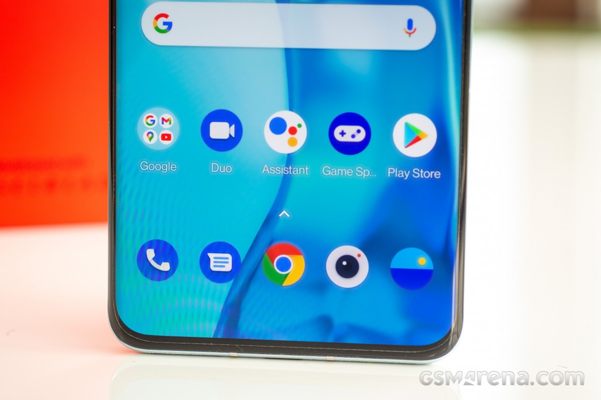
The new Camera app is also nothing to write home about. There are some notable UI changes but this is still largely the same OnePlus Camera app. There's so much OnePlus could have improved upon here but the orange button seems to have taken priority.

The front camera hasn't even changed in hardware. OnePlus is still shipping the same camera as it was on the OnePlus 7 Pro, which now lags far behind the competition.

All of this isn't to say, there aren't any improvements to be found on the OnePlus 9 Pro. The low light performance is excellent and one of the best we have seen. The new ultra-wide camera takes some great-looking images. The video recording quality is good and we particularly enjoyed playing around with the new 4K 120fps files.

It's worth asserting that the OnePlus 9 Pro has good camera performance overall. However, it's still behind the competition in this regard and no amount of marketing will change that.

The competition

With prices going up and the OnePlus 9 Pro starting at a lofty $969, there's no shortage of quality alternatives on the market.
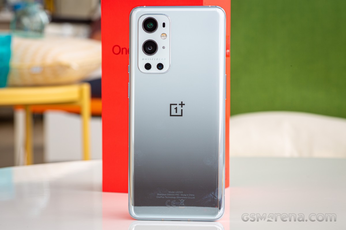
OnePlus 9 Pro review

We will start off with the toughest competitor of all, the Samsung Galaxy S21 Ultra. While the phone is technically priced at $1199, as per Samsung tradition it can frequently be available below that. At the time of writing, the price was down to just $900 with a special coupon, which is handily undercutting the OnePlus 9 Pro launch price.

The Galaxy S21 Ultra is one of the most accomplished smartphones we have tested. Whether it's build quality, display performance, camera performance, or battery life, the S21 Ultra has you covered on all fronts. The camera performance, in particular, is most impressive and we think that the S21 Ultra has one of the most versatile camera systems on the market.

Samsung Galaxy S21 Ultra 5G

Another great option is the recently launched Xiaomi Mi 11, which is Xiaomi's implementation of the 'everything but the kitchen sink' smartphone. While not available in all regions, the Mi 11 does undercut the OnePlus 9 Pro in pricing in regions where it is available. That's not to say it's compromised in any way, as the Mi 11 is packed to the gills with all the bells and whistles. Sure, MIUI may still be an acquired taste but in every other aspect it is a very strong contender in this segment.

Xiaomi Mi 11
Xiaomi Mi 11

Next is the Find X3 Pro from OnePlus' sister company, Oppo. The Find X3 Pro combines a stunning industrial design, top-notch feature set, and an excellent set of cameras, great display quality, and the same sort of blazing fast charging speeds that OnePlus is known for (it's essentially the same tech). At $1099, the Oppo Find X3 Pro comes at a premium but one that may be worth paying, especially if you're already considering spending over $900 on a phone.
Oppo Find X3 Pro
Oppo Find X3 Pro

If you're more into gaming, you might want to consider the ASUS ROG Phone 5. While marketed as primarily a gaming phone, the ROG Phone 5 is an extremely accomplished phone even outside of gaming, with great build quality, a quality display, terrific loudspeakers, great battery life with fast charging, and relatively clean build of Android. And while the camera quality may not be quite on par with some of the other flagships, it's still very impressive and has come a long way from the original model. On top of all that, it's also the cheapest phone in this bunch.

Asus ROG Phone 5
Asus ROG Phone 5

Lastly, there's the Apple iPhone 12 Pro Max. There was a time when it wouldn't have made any sense to compare a OnePlus phone with an iPhone due to the large gulf in price tags, but those days are long gone now. As for the phone itself, it combines exceptional industrial design, class-leading display color performance with Dolby Vision support, an excellent set of cameras all-round, best in class performance, great battery life, easy to use software with unparalleled software and game library, legendary customer support and a high resale value to boot.

Few devices can match the complete package that the iPhone is and the 12 Pro Max is the best of its kind. Sure, the 60Hz display isn't quite modern and the lack of fast charging in the box (or any kind of charging) is disappointing after paying so much but these may be things worth sacrificing if you want one of the most well-rounded smartphones on the market and aren't tied to the Android platform.
Apple iPhone 12 Pro Max

Verdict

The OnePlus 9 Pro is pretty much what we have now come to expect from OnePlus, a likable, dependable smartphone with almost all the bells and whistles one could ask for but not one that's particularly exciting or game changing. It's as if the company is content with making smaller changes rather than doing something disruptive or potentially controversial.
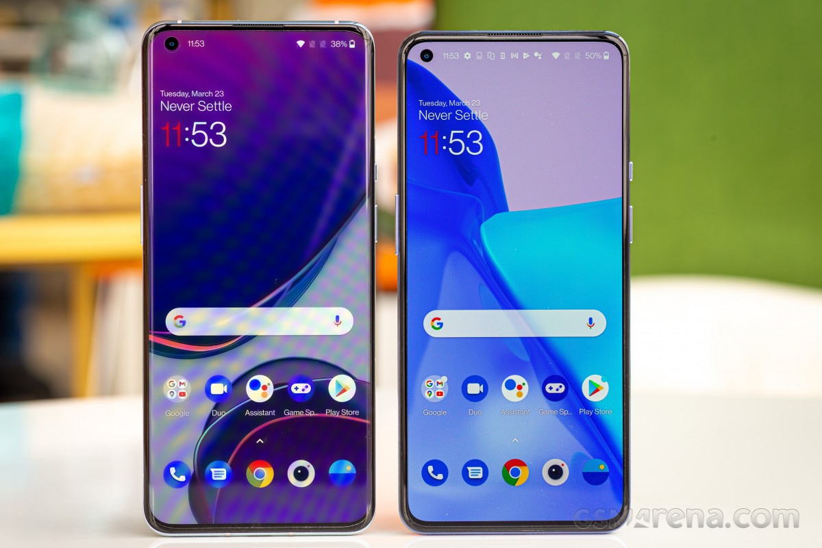
OnePlus 9 Pro review

You can see this in the year over year growth of the Pro line. Whether you look back one year to the OnePlus 8 Pro or even two years to the OnePlus 7 Pro, you aren't going to be seeing a remarkable difference. And that's the crux of the matter here as there is a palpable sense of staleness in the air surrounding the brand that we can't quite shake off.

But this staleness, this sense of contentment with slow progress, is at odds with the steady increase in the price year over year. OnePlus fans and critics over the years have lamented the company's slow but sure move upward on the pricing ladder, turning from the hero who rallied against the oligarchs to living long enough to becoming the villain.
OnePlus 9 Pro review

But with a $969 starting price, the company is now truly into the upper echelon of the smartphone market. We are talking about a market of discerning buyers where there is no room for missteps, misgivings, and certainly no room for slacking or slowing down. Even brands like Samsung have to sweat it out every year to keep customer attention in check and companies like Google who couldn't keep up with the pressure had to fall back and reevaluate.

Is the OnePlus 9 Pro good enough to compete in this segment? Not quite. Sometimes, it's not enough to just dress for the job you want. You also have to be good at it.

Pros

  • Great display performance
  • Relatively clean software and great UI performance
  • Powerful loudspeakers
  • Good performance from the main wide and ultra-wide cameras
  • Excellent 4K 120fps mode
  • Fast charging

Cons

  • Curved display still registers accidental touches
  • Rear camera performance still behind the competition
  • Outdated front camera
  • No pro video features or true HDR recording
  • Hasselblad partnership mostly a marketing gimmick
  • Monochrome camera is useless
  • Worse battery life performance than previous models
  • Most games still locked to 60fps

source: gsmarena.com

AirPods Pro review: you don't need to be an AirPods power-user to appreciate them

30 Mar, 2020
0    

With active noise cancellation and other new features, Apple's new AirPods Pro does its best to embody the "pro" monicker affixed to the well-known name.

AirPods Pro

AirPods Pro are easy to set up


There aren't many things left unsaid about
AirPods Pro. If you've seen or read any of the other reviews out there they likely all touch on the same topics.

We don't need to rehash all of those sentiments by just giving you more of the same. Rather, we want to give you a look at our past week using AirPods Pro after being daily users of the original AirPods —pretty much since launch.

A quick look at the specs


Before we do that, it would be irresponsible to not at least touch on the specs AirPods Pro is equipped with.

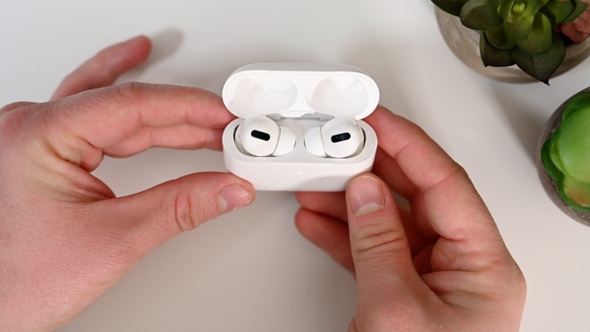
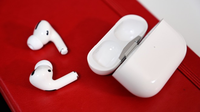
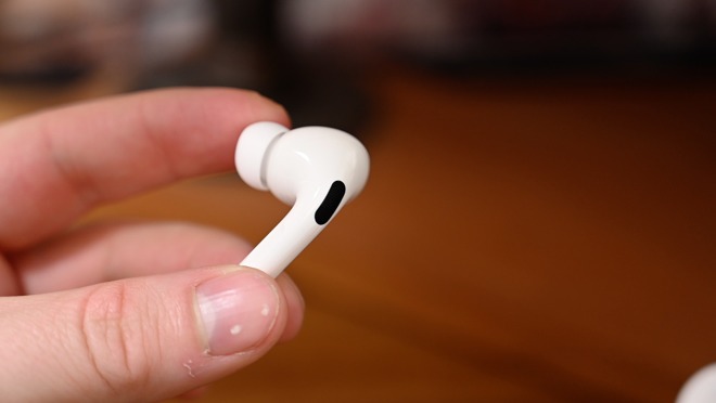
The new generation Apple true wireless earbud has a new design that is shorter with a more bulbous end. A new force sensor in the stem replaces the tapping gesture for controlling the headphones. Multiple sizes of silicone tips help provide a better seal and fit to help with the new noise control features.

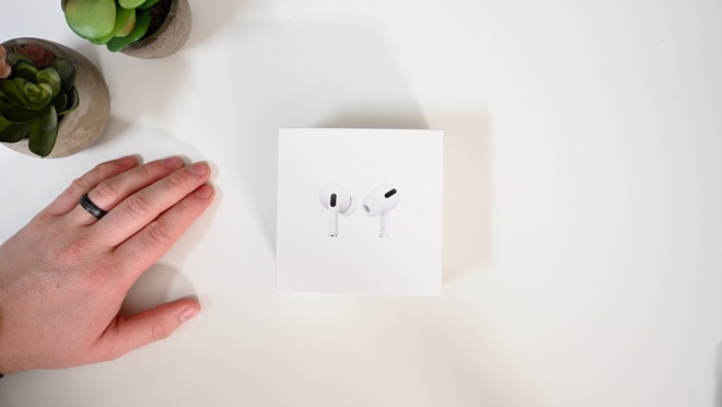
AirPods Pro in their box

AirPods Pro in their box


Speaking of which, include active noise cancellation, Adaptive EQ, and transparency mode. These all rely not only on an external mic but an internal mic that can hear what your ear is hearing.

They now fit in a redesigned wireless charging case that is shorter and wider than the original.

More than what we asked for


Preceding the AirPods Pro announcement, there were only a couple things we needed to see on a new set of AirPods. We wanted a better fit for active lifestyles and better audio quality. AirPods would constantly fall out for us while we were hitting the treadmill or weight bench and the audio quality could best be described as "fine."

AirPods Pro

AirPods Pro are great headphones


Audio quality was quite a sticking point for us. We test piles of headphones with outstanding sound but always go back to AirPods because of their ease of use. It was disappointing to come back to such dismal audio.

Upgrading to pro


With those in mind, the absolute first thing we did after getting our hands on AirPods Pro was hit the gym, testing all of our common routines. To our surprise, we made it through an hour and a half without a single earbud coming free. Whether jumping around or lying supine, AirPods Pro didn't fall out.

AirPods Pro silicone tips come in small, medium, large

AirPods Pro silicone tips come in small, medium, large


That isn't to say that the fit was perfect for us. We've historically terrible luck with in-ear headphones. They never stay put for us.

As a general rule, AirPods Pro did fit well for us, but we could use more sizes of the silicone ear tips. A smaller size or half sizes would go a long way towards making these fit perfect. Apple, like Klipsch, chose to use an oval-shaped tip which could be part of what makes it stay in so much better, even with not the perfect size.

Apple does offer up the fit test within Bluetooth settings and while neat, didn't provide any real benefit to us. We could tell what fit very easily just by trying on the different sizes, but maybe it is more beneficial to others with differently shaped ears.

The audio quality was great. With a good fit, it was punchy, a full sound, and a huge step up for AirPods. Not saying this is audiophile quality or what you'd get with a set of dedicated over-ear cans, but wow. We were very happy with the audio quality these put out.

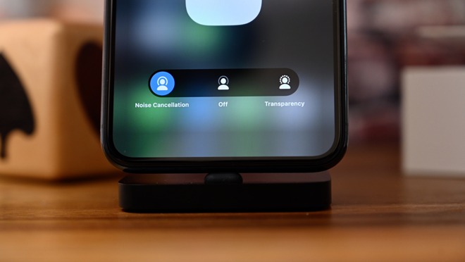
The nosie control toggle within Control Center for AirPods Pro

The nosie control toggle within Control Center for AirPods Pro


The active noise cancelation was a bonus for us, but a week in and we don't use it as much as others may. It is nice to have and we used it in the gym for a more immersive workout, but day-to-day we relied on transparency mode. It sounded so much more natural and allowed us to hear people talking to us in the office, delivery drivers hitting up the door, or other runners while we were out with the dogs. It may be our favorite feature of the new AirPods Pro.

In this set of AirPods, Apple forwent the tapping gesture and replaced it with the force sensors in the stems. This requires you to squeeze the stems to control playback and switch modes. The good news is that it adds more gestures than tapping, but it is still awkward to use. If you are moving, trying to squeeze will inevitably knock the AirPods Pro loose. Second-gen or AirPods Pro —we'd still prefer to just use Siri or our Apple Watch.

While we are here, we also want to give a shoutout to iOS that recently added some great features for AirPods users. Not specifically for the AirPods Pro, but great either way.

With this update, users can now have messages announced via Siri. It will automatically reduce any audio that'splaying, read the message, then quickly give you a chance to respond. If you are busy and on the go, this is amazingly helpful and we found ourselves wearing AirPods around the office just so we could respond to messages without having to dig out our phone each time.


Additionally, Audio Sharing —a feature promised with iOS 13 —finally arrived in iOS 13.2. This allows users to share audio with multiple sets of headphones at once. Say you are watching a movie and your partner wants to watch as well with their headphones. They just bring their AirPods or Beats near your phone or tablet and it will kick off a modal that lets audio be sent to each simultaneously. Works with any audio, including movies, music, or games.

Not without issues

As far as issues we ran into, during long sessions we did have the battery die out on us, which is unsurprising. They're equipped with the same battery life as the AirPods 2 but take a small hit when ANC or transparency mode is turned on. It'd have been nice to see a longer life, but we will take the smaller size as the tradeoff.

We also aren't fans of the new case. Maybe it is nitpicking, but it is what has gone through our minds several times during the past week. It is squat and kind of awkward in our hand and isn't as easy to flip open as the original. The original case was fantastic and was even useful as a fidget device we could open and close repetitively. This case, while it looks similar and feels the same, just doesn't have the same affinity to us.

An AirPods Pro individual earbud

An AirPods Pro individual earbud


There were some improvements to the microphone, which now block out wind better than before, but the same issues as the last generation are present. Namely, they are very sensitive. It is great in picking up your voice, but if you try to do anything with your hands at the same time it gets amplified greatly. Pick up a cup, crinkle a chip bag, wash your hands, really anything that makes any noise sounds crazy on the other end. In a test call, I set down a cup on the counter and the recipient of the call said it sounded like I smacked a hammer against a pipe.

Minor quibbles notwithstanding, we're overwhelmingly happy with AirPods Pro.

Should you buy AirPods Pro?


If you are an active user, moving around, jumping on planes, or frequently working out, AirPods Pro are the way to go. Otherwise, it gets murky.

Most folks are going to fall into one of three camps. They are either existing AirPods owners who are debating an upgrade, they are new to AirPods and debating the AirPods second-gen with wireless charging case, or they are new users looking at the second-gen with the standard case.

If you are in the latter camp, it is kind of hard to justify the $100 price increase between the two. There are a lot of features for that differential, but if you just want AirPods in the most cost-efficient form, then it isn't AirPods Pro.

If you are looking at the second-gen set with the wireless charging case, springing for AirPods Pro is a no-brainer. It is a $50 difference and you get better fit, water resistance, ANC, transparency mode, and far better audio. We'd make that jump in a heartbeat.

Those in the last group are hardest to quantify, being that they already have a set of AirPods —possibly the second-generation set that launched only in March. For us, with audio quality and fit being most important, we were able to justify it. Especially after gifting our other set to a family member. Before AirPods Pro we were forced to use another set of headphones while at the gym. With AirPods Pro, we get to use them twice as much.

Pros

    • Smaller design

    • Much better audio quality

    • Great ANC

    • Transparency mode is outstanding

    • Stay in much better

    • Work with Audio Sharing

    • Announce messages with Siri is particularly useful

  • Water/sweat resistant


Cons

    • Needs more granular ear tips

    • Force sensors are awkward to use

    • Charging case is awkward

  • Higher price tag and no price decrease on second-gen


Rating: 4.5 out of 5


source: appleinsider.com

Cleer Audio Ally Plus Earbuds offer active noise cancellation in a sophisticated package

30 Mar, 2020
0    

Cleer Audio's Ally Plus is a pair of truly wireless earbuds that feature a slick design and active noise cancellation, making them an attractive alternative to Apple's AirPods Pro. We put the audio accessories through their paces.


It's hard not to be smitten by the appearance of the Cleer Audio's Enduro 100 wireless headphones, with impressive design and good solid construction, as well as the massive 100-hour battery life on a single charge. When given the chance to check out Cleer's new truly wireless earbuds, I was curious to see how well they'd perform.

Design & fit


Ally Plus in case


I tend not to think about the overall aesthetics of earbuds, which may be because people can't see whatever earbuds they're wearing without looking hard in a mirror. However, I will say that as far as looks go, the Ally Plus are some of the nicest truly wireless earbuds I've come across. The metallic accents feel very mature, and the clean lines look great.

The case design is also nifty, as it's small, metal, and features a magnetic hinge with a clear window —there's no guessing whether or not both earbuds are inside. It looks nice enough to be left out on the desk but holds up to being tossed in my laptop bag as well.


One of the best things about the Ally Plus is the fact that they sit comfortably in my ears. I was concerned that they'd be too big and prone to falling out, but so far I haven't had a single issue with the fit.

Cleer also includes multiple silicone tips for the earbuds, so most users will be able to find a setup that works well for them.

Ally Plus earbuds


If you're a regular gym-goer or an outdoor athlete, you'll be happy to learn the Ally Plus are IPX4 water-resistant. They can handle light rain and your sweatiest workouts with no problem.

Pairing & controls


Like most truly wireless earbuds, the first time you open the Ally Plus' case and remove the earbuds, it'll automatically enter pairing mode. It paired with a MacBook Pro quickly and without issue.

I did have to follow the manual to pair the earbuds to my iPhone later, but thankfully it's less convoluted than other earbuds I've tested.

The touch controls for the Ally Plus are simple and relatively standard. Swiping up and down will change the volume, a quick tap cycles through noise cancellation modes. You can also tap to answer calls or hold to reject them.

I was a little annoyed to find out there is no way to cycle through a playlist or skip songs while wearing the Ally Plus, which means they're not as hands-free as I prefer my wireless earbuds to be.

Sound control & battery life


When it comes to sound quality, the Cleer Ally Plus earbuds outperform the average mid-range wireless earbuds. As the earbud tip can be changed, you can create a sealed fit that helps to keep the bass adequately rumbly.

They feature 10mm neodymium drivers and updated beamforming technology, resulting in crisp highs, and even when turned up quite high, there's no distortion in any area. Overall, they're quite impressive.

Unlike a lot of other earbuds out there, these also feature active noise cancellation, rather than just passive. The Ally Plus did a decent job blocking out most environmental background noise, which would make these perfect for a long commute, air travel, or when working out.

The Ally Plus case charges via USB-C

The Ally Plus case charges via USB-C


The battery life of the Ally Plus is also an improvement over some other truly wireless earbuds as well. On a full charge, the Ally Plus earbuds gave a little over 11 hours of battery life before they had to return to the case. When fully charged, the case can provide you with 20 additional hours of playback —making the Ally Plus great for weekend trips or extended travel days.

The usual discomfort


For as comfortable as they are, the Ally Plus do cause me a fair bit of ear pain when I use the noise cancellation mode. Some people —like myself —have problems with active noise cancellation. I have a pair of on-ear Bose headphones that also give me ear pain if I wear them with noise cancellation mode activated, but it usually requires me to wear them for a couple of hours before I have to take them off.

The Ally Plus, however, gave me significant ear pain in as little as 45 minutes. This may not be the case for everyone, but I'd be remiss if I didn't mention it here.

Overall


I like the Ally Plus. I think they're a great pair of earbuds with a design that makes them geared a bit more toward a sophisticated audience. My only major complaint is the lack of audio control included with the touch controls, but for regular day-to-day use, I find myself reaching for them over and over again.

Where to buy

:

If you want a pair of your own Cleer Audio Ally Plus earbuds, head to
Amazon or Cleer Audio's website, where you can purchase them for for $199.99.

Rating: 4 out of 5 stars


Pros

  • Sophisticated design
  • Active noise cancellation mode
  • 10 Horus battery life


Cons

  • Active noise cancellation mode may give some users ear pain
  • No on-device music control

source: appleinsider.com

2020 iPad Pro is more about future software than the hardware gains today

30 Mar, 2020
0    

The new 2020 iPad Pro is slightly more powerful than ever, and that minor spec upgrade that it got this time around, it is now more about what can happen with software down the road than hardware improvements today.

11-inch 2020 iPad Pro with the Smart Keyboard Folio

11-inch 2020 iPad Pro with the Smart Keyboard Folio


When Apple launched iPad back in 2010, it didn't quite know what iPad would be. It went through a number of exploratory phases like going all-in on periodicals with Newsstand before killing it off then coming back with Apple News+ years later, and adopting the Apple Pencil.

During the time of the first iPad, little did we know that iPad would eventually embrace the mouse or trackpad, and cameras would play a huge part of the iPad's feature set.

Yet here we are, in 2020, with the latest iPad Pro that does all of those things. Apple's iPad is no longer just a consumption device or a casual tablet for light work —it is a full-on content-creation, multitasking, mouse-wielding, portable device that can get the job done.

When we tell people that we use iPad as a tool to produce 4K videos or as our writing instrument of choice, people no longer show surprise or act as if its some insurmountable task. People everywhere have embraced iPad for a huge array of different purposes and the 2020 iPad Pro is absolutely the best one yet —even if the differences model-over-model aren't all that riveting.

Hardware changes on iPad, like iPhone before it, have become a bit more predictable and a bit less flashy. Apple has iterated on tried-and-true tactics to perfect the device while also focusing strongly on the software.

Apple started down this road in 2019 with the branching off of iPadOS from iOS to allow more iPad-specific features and we expect Apple to continue that trend.

Cursor support arrives on iPad

Cursor support arrives on iPad


Announced alongside the new iPad Pro was iPadOS 13.4 that, much to everyone's surprise, brought full-fledged cursor support plus support for Bluetooth mice and trackpads to the tablet line. For productivity users, this update paired with iPadOS will play a large part in how successful the iPad Pro is as a pro tablet.

De-prioritizing hardware changes


11-inch iPad Pro

11-inch iPad Pro


This time around, the physical changes to iPad Pro are minimal. It looks identical to the 2018 iPad Pro.

The new iPad Pros still have the same gorgeous Liquid Retina display, the same support for Apple Pencil, and the same TrueDepth camera system.

The new camera bump houses a 12MP wide-angle camera and a 10MP ultra-wide angle camera

The new camera bump houses a 12MP wide-angle camera and a 10MP ultra-wide angle camera


Where it changed primarily was with the rear-facing cameras. It got a new 10MP ultra-wide-angle camera and a new LiDAR scanner. These are big changes, but if you don't ever use augmented reality or take photos with your iPad Pro they are largely a moot point.

The tablets now support Wi-Fi 6, though you need a Wi-Fi 6 router to take advantage of that feature. The base models now start at 128GB of storage rather than only 64GB.

Apple even slipped essentially the same processor as the previous generation in, just incrementing the letter and activating one additional GPU core. A new report says the A12Z is the exact same chip as the A12X, but the latter had one of the eight GPU cores deactivated. They enabled it with the A12Z and stuck a new marketing name atop.

That paints a fairly underwhelming picture if you own a 2018 iPad Pro and wanted a big worthwhile, headline-grabbing reason to upgrade. Fact is, almost everyone on the 2018 iPad Pro will have no need to make the jump, unless you want that LiDAR scanner.

Taking measurements with iPad Pro as a massive viewfinder

Taking measurements with iPad Pro as a massive viewfinder


iPad Pro, as much as some don't want to admit it, is starting to be more like a computer. Most folks don't upgrade their Mac every year because a new model drops, yet a kitted-out iPad Pro can get into 13-inch MacBook Pro territory.

So while these changes aren't flashy for 2018 would-be upgraders, they are quality of life improvements for anyone else who was contemplating picking one up.

The iPad Pro was already such a powerful and polished device that its biggest gains were to be had through software, and possibly additional accessories. We're looking at you, Magic Keyboard, that has yet to ship.

Performance ceiling


There is something to be said for Apple making its own chipsets. They are industry-leading in power and battery utilization and have been for some time. It poses a bit of a query for Apple when developing a new chip. In the case of iPad Pro, most users weren't hitting the performance ceiling that the A12X Bionic imposed.

Multitasking App Switcher on iPad Pro

Multitasking App Switcher on iPad Pro


In reality, the biggest spec iPad Pro had to boost was graphics. And not because the previous-generation graphics were underpowered, but because you can always encode that video faster or export that massive RAW image quicker. This is what Apple gave us in the new A12Z Bionic processor, slightly better graphics.

To test, we ran the latest Geekbench 5.1 benchmarks. Our 2018 iPad Pro delivered around a 1116 single-core and a 4584 multi-core score. The new 2020 model garnered a similar 1117 single-core and a 4653 multi-core. These are effectively identical results if you take into account the variability of Geekbench testing.

An extra GPU core means better graphics scores. 2018 iPad Pro (left) compared to 2020 iPad Pro (right)

Geekbench Computer Metal graphics test on 2018 (left) and 2020 (right) iPad Pros

Geekbench Computer Metal graphics test on 2018 (left) and 2020 (right) iPad Pros


When we turned to the Geekbench Compute benchmark which tests the Metal graphics performance, the 2018 Pro earned a 9069 while the new 2020 pulled a 9616. This gain is explained by the increase in GPU cores within the A12Z Bionic.

For another test, we turned to iMovie. We created a four-minute and 39-second 4K video on the new and previous-generation iPad Pro and exported the video for sharing. The 2018 iPad Pro took 20.05 seconds to complete and the 2020 iPad Pro only took 5.12 seconds.

This is a practical real-world gain and demonstrates why even just one additional core can make a difference. Videos editors who are doing more than just a four-minute clip are going to be happy with those improved render times.

iPad Pro cameras


The iPad Pro doesn't have quite the same 12MP camera as the iPhone 11 does, but it isn't far off. The cameras aren't just used for taking pictures of your pets, there are a ton of commercial and professional applications as well. For these, a competent camera is necessary.

New camera module on 2020 iPad Pro

New camera module on 2020 iPad Pro


The ultra-wide lens helps out further. It is only 10MP, but otherwise takes decent shots. The ultra-wide, like it does on the iPhone 11 line, takes in up to twice as much horizontally. Perfect for close quarters or scenic views.

There is a part of us that wishes Apple would have taken advantage of this lens to enable 1X portrait mode on the iPad, or even standard 2X with the help of both lenses or even the LiDAR scanner. At the same time, we don't want to necessarily encourage everyone to prioritize taking pictures with a massive tablet.

LiDAR demo using a pre-release version of the Primer app

LiDAR demo using a pre-release version of the Primer app


The LiDAR scanner sits next to the other dual shooters. LiDAR, an acronym for light detection and ranging, measures how long it takes for light to hit a surface and return which allows the system to create a 3D image of the scene in front of it.

The most obvious use of LiDAR is to enhance augmented reality capabilities, a vertical Apple has been exploring for quite some time. LiDAR assists with person occlusion and is able to create a real-time mesh around complicated scenes.

We saw this for ourselves when we spoke to the developers behind the Primer app. This app allows you to preview wallpaper, paint, or tile in your own home. After only a couple days with the updated ARKit 3.5 SDK they were able to get a working build. It is quite impressive, though it loses its luster if you don't have any practical application for AR in your own use.

Updated Measure app on iPad Pro

Updated Measure app on iPad Pro


Without any user-facing application, other than the Measure app, most users may never even know the LiDAR scanner exists.

The new Measure app easily finds vertices

The new Measure app easily finds vertices


Speaking of the Measure app, Apple did take the chance to improve it on the new iPad Pro. In our tests, it is more accurate, faster, better at detecting surfaces, and can display a running list of measurements for you to copy out to notes, a message, or an email.

It snaps to edges, can project angles, and aws closer to the actual values when compared to a physical measuring tape measurement.

The Apple accessory lineup


Per usual, Apple has myriad accessories it hopes to add to your iPad Pro setup.

2020 iPad Pro in the blue Smart Cover

2020 iPad Pro in the blue Smart Cover


There is an updated version of the Smart Cover which comes in new colors but otherwise functions as it always has. Using magnets, it wakes and sleeps your iPad Pro when it opens and closes and can roll back to act as a stand for the iPad Pro in both vertical and horizontal orientations.

Using the second-generation Apple Pencil with 2020 iPad Pro

Using the second-generation Apple Pencil with 2020 iPad Pro


Then we have the second-generation Apple Pencil. Nothing changed here either and our original review still stands. It remains a greatly useful device for drawing, note-taking, coloring, dealing with documents, or editing photos.

Our biggest hangup is with the Smart Keyboard Folio. It was mildly updated to highlight the Apple logo horizontally while typing, but otherwise appears to be the same. Unfortunately, there were issues with the design that debuted with the 2018 version. We aren't talking about all our gripes we highlighted in the original review, we are talking about reliability issues that have sprung up over time.

Typing on the Smart Keyboard Folio can be frustrating

Typing on the Smart Keyboard Folio can be frustrating


We have had our Smart Keyboard Folio swapped out twice but it appears the issue is systematic and plagues all the units across the board. Because the keyboard of the folio is atop a thin piece of plastic, it has a tendency to warp as well as inadvertently "press" certain keys. It happened most frequently with the lower-left command key for us which cause all sorts of issues while trying to write.

To remedy, we have to briskly wipe our hand across the keyboard to unstick the key. Luckily the solution is that simple but it is annoying and an issue nonetheless.

iPad Pro Magic Keyboard

iPad Pro Magic Keyboard


These issues appear resolved in Apple's Magic Keyboard for the iPad Pro. Launching in May, the Magic Keyboard has physical keys with a mechanical scissor-switch mechanism, a backlight, a fully articulated holder for the iPad Pro, and an additional USB-C port.

The USB-C port will be perfect because it doesn't require any additional hub to both power the iPad Pro, as well as to connect external storage or a monitor.

That leaves us in limbo until the Magic Keyboard launches, but we are very excited to test it out. Even better, it will work on the 2018 iPad Pros giving existing users an upgrade of sorts.

A true pro device has emerged


After years of incremental updates, the iPad Pro has finally started to come into itself. The hardware overhaul in 2018 was major but the software updates iPadOS 13 and iPadOS 13.4 have cemented the iPad Pro as a true workhorse.

iPad Pro

iPad Pro


Truly, the 2020 iPad Pro doesn't feel much different at all than the 2018 model. We have relied on the Measure app a few times as we are doing some renovations, but otherwise, it has been business as usual.

It is mildly faster for content exports and any extra headroom for large photo edits is appreciated. USB-C is still a favorite for us, allowing us to rely on external SSD storage, connect an external display to edit video, and connect other peripherals such as microphones.

Apple may have slowed down the pace of iPad Pro hardware refreshes. It appears that Apple does seem to have some surprises left in store for the next model, but even with that rumored refresh, software is going to be the focus going forward more than any other factor.

Should you buy the 2020 iPad Pro?


11-inch and 12.9-inch iPad Pros

11-inch and 12.9-inch iPad Pros


As with any other "buy or not" debate, it all hinges on the work that you do, the tools you need, and what devices you are coming from.

If just looking at the device in a bubble on its own merits, the 2020 iPad Pro is a stellar device. Apple has made strides over the years, iterating on the small aspects to perfect the user experience of the device.

The 2020 iPad Pro is more powerful than ever, more full-featured than ever, and has a mass of potential waiting to be unleashed by iPadOS 14 and the updates that follow. You just probably don't need it if you jumped on the 2018 refresh.


Pros

    • Still a great-looking tablet

    • Better graphics, albeit not by much

    • Wi-Fi 6 support

    • Both the 2018 and 2020 will support Magic Keyboard

    • iPadOS 13.4 is a great update for iPads across the board

    • Revamped Measure app is much better

    • LiDAR is a game changer, but only if you use AR

  • Ultra-wide lens is great for those who need the camera


Cons

    • Increimental update

    • Smart Keyboard Folio still has problems

    • LiDAR has no user-facing app and relies on developers to use

  • No notable speed improvements


Rating: 4 out of 5


source: appleinsider.com

Brydge Pro+ keyboard & trackpad both helped & hindered by iPadOS

30 Mar, 2020
0    
The Brydge Pro+ is an all-aluminum keyboard and trackpad designed specifically for the 2018 and 2020 iPad Pros. While the hardware is in the right place, the changes in iPadOS 13.4 have left us wanting a bit more for this otherwise excellent accessory.

Brydge Pro+ and the 12.9-inch 2020 iPad Pro

Brydge Pro+ and the 12.9-inch 2020 iPad Pro


On both iPhone and iPad, Apple has a feature called AssistiveTouch. With this enabled, you could finally use a rudimentary cursor on your device using a wired mouse. It wasn't flashy and only had basic support. It was, after all, still an accessibility feature, but Brydge sprung into gear to take advantage of it.

We've looked at previous Brydge keyboards, such as the Brydge Pro for iPad Pro. It was a solid keyboard with an aluminum frame that cleverly connects to the iPad Pro when needed. Brydge Pro+ is an evolution of that, integrating a trackpad to take advantage of that new accessibility feature found on iPads.

The device crept closer to launch, before a curveball was thrown.

An iPadOS 13.4-shaped curveball


Brydge wasn't expecting this at all. Brydge announced the Pro+ months ago. We even went hands on ourselves at CES 2020 to test it out. Everything seemed set to go.

Then Apple dropped iPadOS 13.4 which had previously-unannounced support for a cursor as well as Bluetooth mice and trackpads.


Things changed then drastically for Brydge. With that simple update, Brydge Pro+ both lost features as well as gained new ones. On one hand, there are now native aspects and gestures that you can do throughout the OS with any connected mouse. But, Brydge lost its own gestures that it was hoping to debut with.

We've covered cursor support extensively so far and it is impressive how Apple added it to the touch-first interface in an intuitive way. Because of that, it makes Brydge Pro+ even more exciting of a prospect and anticipation for the new keyboard-mouse combo has skyrocketed.

A familiar design


First things first — the design of the Brydge Pro+ is very familiar. It looks like an iteration on the previous Brydge designs as well as a MacBook. It has the large mechanical keyboard sitting atop that new trackpad.

Brydge Pro+ closed

Brydge Pro+ closed


At launch, Brydge Pro+ will only be available in space grey. That seems to be the more popular color and it has done an excellent job at matching it to the color of the iPad Pro.

The hinge on the Brydge Pro+

The hinge on the Brydge Pro+


The hinges have been adjusted and they are our favorite ones from Brydge yet. They are very minimalistic and you practically don't notice them when looking at the iPad from the front. Around back there is a bit more surface area.

To keep with the iPad Pro's design, the hinges are a bit more squared off. They have the rubberized inserts that now go just around the corners which adds a small amount of drop (or bump) protection. The hinges also have a small strip of rubber that, when opened, keeps the Brydge from hitting the surface below it.

Brydge Pro+ comes with a magnetic back panel

Brydge Pro+ comes with a magnetic back panel


We've seen a lot of Brydge keyboards and this one looks and feels like the most polished one yet.

There is a faux leather back panel included in the box. Ours arrived with one designed for the 2018 iPad Pro though new orders will ship with one designed to fit the 2018 and 2020 models.

Charge Brydge Pro+ over USB-C

Charge Brydge Pro+ over USB-C


The whole thing is charged over USB-C, and a full charge should yield about three months of use. This is different than the Magic Keyboard, which connects over the Smart Connector and never needs to be charged, though it does leach some of the iPad Pro's power.

What is great about the USB-C port is that in an emergency, Brydge can be charged right from the iPad's own USB-C port.

The trackpad


With the trackpad, we have a lot to evaluate. How does it integrate into the system, does it support any form of multi-touch input, and how does the surface itself feel.

Brydge has once again done an excellent job when it comes to build quality. The trackpad is very large and spacious. It feels like the perfect width because when in a natural typing position, the trackpad comes just to where our palms are resting. Very nicely done.

Brydge Pro+ in space gray matches perfectly

Brydge Pro+ in space gray matches perfectly


The trackpad uses a common trackpad "diving board" design. What this means is that the top of the trackpad is fixed and the rest of the trackpad can be pressed down to "click."

However, we've become spoiled in recent years, seeing what Apple has done. Apple's Mac trackpads are a large surface that never actually moves. The Mac trackpad simulates a click by triggering a short vibration — or haptic feedback. This allows the entirety of the trackpad's surface to be "clickable."

Sometimes we expect to be able to press down on top of the Brydge trackpad and it doesn't move.

The new trackpad on the Brydge Pro+

The new trackpad on the Brydge Pro+


The good news is that tapping is unaffected. The entire surface can be tapped and we find tapping to be faster anyway, so we don't count it as much of a detraction.

As we use the trackpad with the iPad, there is a bit of a delay. The way that the Brydge Pro+ connects causes there to be some lag as you track the mouse around the OS.

We don't necessarily blame Brydge for this as some fault belongs to iPadOS for how it is interfacing with these Bluetooth peripherals. There's similar lag experienced with some other Bluetooth mice as well.

Moving the mouse around the iPad's display isn't the biggest issue we have, as that lies with the scrolling. You can scroll using the trackpad by moving two fingers up and down — same as with Apple's own trackpad, but it is very jarring.


It sometimes feels like the iPad isn't responding, but it clearly is as if you try to move the display with your finger, it moves just fine.

Again, the problem is clearly with iPadOS here. Sometimes if you scroll on a screen, it just keeps going, showing nothing on the display as you've scrolled far past the page's contents.

Considering mouse and cursor support is so new, a lot of these issues are going to be ironed out, but that is just the playground Brydge chose to play in when they started developing the Brydge Pro+.

Brydge Pro+ trackpad in use

Brydge Pro+ trackpad in use


Another side effect of the iPadOS 13.4 update has been gestures. Brydge no longer now supports its own multi-touch gestures with three or four fingers. You can't swipe down with three fingers to open the app switcher and you can't slide left or right with multiple fingers to move between apps.

Instead, iPadOS has replaced many of those with its own native versions. To go back to the home screen, just swipe to the bottom of the display. To open the app switcher, repeat that same motion. To open notifications, move towards the top. To the right will open Slide Over apps. It all is very easy and doesn't require multi-finger input.

You can tap with one finger, secondary click by tapping with two fingers, and if you venture into the accessibility settings you can enable whatever you'd like for a three-finger tap. For ours, we open the app switcher but you can program this to open Control Center, go to the Home screen, run any Siri Shortcut that you've created, and much more.

The keyboard


Turning to the keyboard, there is a lot going on as well.

For the layout, it is a full, standard keyboard that also has a dedicated row of function keys along the top. In the lower-left corner where we traditionally see the localization globe icon, we have a Siri button. We like this as we are more often invoking Siri rather than switching languages.

The keyboard of the Brydge Pro+

The keyboard of the Brydge Pro+


Fret not those who do use localization frequently, it is just in the row of function keys. From left to right we have the Home button, the quick lock, keyboard backlight control, iPad brightness controls, the onscreen keyboard, localization, media controls, volume, Bluetooth, and power.

This is a solid set of function keys and ones we will use frequently. We still aren't sure why Apple hasn't added a row of function keys to the Smart Keyboard Folios.

Typing feels very natural on the Brydge Pro+. The keys are tactile, easy to feel, and have a good amount of key travel. When pressed, there is a solid moment where you can feel the key is pressed, but it also feels a little soft. This isn't a bad thing necessarily because typing on the keyboard is very quiet.

If you work in a crowded space and are self-conscious about how loud you're being as to type away, Brydge is going to be great. We are thinking classes or work meetings where you'd not like to disturb everyone else as you take notes.

The entire keyboard of the Brydge Pro+

The entire keyboard of the Brydge Pro+


Brydge Pro+ has an integrated backlight to the keyboard which has varying levels of brightness that can be adjusted through the single function key. It doesn't adjust automatically but is easy enough to control. It lights up the glyph in the center of each key but it also has a lot of light bleed.

A ring of light can be seen glowing from behind each key which can be distracting. We'd prefer if the light was more contained and only light up the character or symbol within the keycap.

We tested out the 12.9-inch version of the keyboard and the keys felt nicely spaced and we didn't need any time to adjust to it coming from our desktop Apple wireless Magic Keyboard. If using the 11-inch version, it will be slightly smaller and the keys a bit tighter, so prepare for a slight adjustment if you go that route.

Should you buy the Brydge Pro+?


Brydge has put forward a very good case on why you should pick up the Brydge Pro+. The hardware feels excellent. The keyboard is pleasant to type on. The hinge is minimal and very easy to adjust at any angle. And the latest iPadOS update integrates the trackpad much further into the user experience.

The Brydge Pro+ from the front

The Brydge Pro+ from the front


At the same time though, Apple is still ironing out the kinks and third-party hardware manufacturers have to work around Apple's limitations. The mouse has just a bit of drag as it moves around and scrolling can be quite awkward.

These drawbacks aren't huge, and the device is still useable. We created this entire review on a 2020 iPad Pro using the Brydge Pro+ and loved the ability to easily get to a trackpad when trying to precisely edit text. You notice the quirks and the minor glitches, but it wasn't enough to turn us off completely.

It is just disappointing that Brydge created such a steller looking and working product yet iPad doesn't want to all the way play nice.

We are certain this will improve, but for now, there will be minor tradeoffs while using the Brydge Pro+.

Pros
    • Sleep, iPad-like design

    • Space gray color matches perfectly

    • Keyboard feels great to type on, if not maybe a little soft

    • Function keys are very useful

    • iPadOS 13.4 makes the cursor a first class citizen

    • More affordable than Magic Keyboard

    • Variable backlight

    • 180-degree hinge

  • Inlcuded back protection


Cons
    • More effort to remove than Smart Keyboard Folio or Magic Keyboard

    • Backlight has a lot of bleed around keys

    • Due to iPadOS, scrolling can be jumpy and awkward

    • Also due to iPadOS, the cursor isn't as smooth as Apple's Magic Mouse or Magic Trackpad

    • Still a premium price

  • Only space gray color available (at launch)


Rating: 3 out of 5


Where to buy


The Brydge Pro+ keyboard and trackpad will start shipping at the beginning of April and starts at
$199 for the 11-inch version, while the 12.9-inch version goes up to $229.
source: appleinsider.com

Louis Vuitton Horizon earbuds are the luxury headphones you can't afford-or can you

30 Mar, 2020
0    

Luxury fashion brand Louis Vuitton has partnered with premium audio company Master & Dynamic for the second time in creating the epic Horizon true wireless earbuds. While the high price tag keeps them out of reach for the masses, they are no doubt a stunning piece of tech.


The Louis Vuitton Horizont true wireless earbuds may look familiar. That's because they are a branded, customised, and improved version of the recent Master & Dynamic MW07 Plus earbuds. When it comes to all-important audio quality, the MW07 Plus is going to perform the same. The main features of the headphones remain the same as well.
Everything else —from the packaging, to the charging case, to the exterior appearance —has all changed. Let's see what the Louis Vuitton brand brings to set these excellent headphones apart.
Premium is all about the experience


As a luxury brand, Louis Vuitton is all about the user's experience. From opening the box, to handling the product, to actually using the headphones themselves.
When the headphones arrive, it is the gold-standard of an unboxing experience —literally. The box is wrapped in a gold linen paper and closes magnetically with the Louis Vuitton logo emblazoned on the top.


Once opened, the headphones inside their carrying case reside to the left and a small blue pull-ribbon is on the right. Pulling the ribbon reveals two canvas Louis Vuitton bags. One bag holds all the replacement silicone ear tips and the other a USB-C cable and USB adapter.


The cable is a nylon-wrapped cable with the "LV" wordmark printed on each of the metal overmolds. It has an integrated leather cable wrap to keep it organised when not in use. The cable is a USB-C to USB-C cable, and a metal USB-C to USB-A adapter is included for anyone who has legacy ports still around and requires that Type-A connector.


Before getting to the headphones, also in the box is a getting started manual, and a linen envelope with a Louis Vuitton-branded polishing cloth.
Louis Vuitton Horizon

Then we have the headphones themselves. These headphones are just stunning. The earbuds are nestled inside a glass and steel case. That case is a polished space black colour. The bottom is ceramic and has a Louis Vuitton logo and Mongram flower pattern on the underside. On top of the case is a clear sapphire glass window that highlights the headphones inside and has a ring of Monogram flowers around the edge.

It feels solid, looks gorgeous, and is a step up from the masses of plastic charging cases out there.


That case gets slipped into its own case, crafted from supple leather that is ever so soft on the inside as to not cause any abrasions to the stainless steel case. It has a contrasting leather pull for a zipper that seals it shut.


Each of the individual earbuds has a polished acetate body with "Vuitton" etched into the side with a stainless steel "LV" circle embedded.
Audio quality


As we mentioned, these are a modified version of the newest MW07 Plus true wireless headphones. That means they carry many of the same properties we highlighted in that standalone review.

The headphones have custom 10mm beryllium drivers, four embedded microphones, single-earpiece use with the left or right headphones, proximity sensors for auto-play and auto-pause, IPX5 water resistance, and Bluetooth 5 connectivity.
Here is an excerpt from our MW07 Plus review when it comes to audio quality.


"One of our favorite songs to test with is Queen's "Bohemian Rhapsody." It is such an eclectic song with guitar solos, heavy bass hits, high pitched operatic sections, and more. It does a great job pushing the headphones to the limits and shows their strengths.
A high point for the MW07 Plus is again right before the tempo increase during one of many guitar solos. The subsequent operatic section also was a pleasure to listen to. With so much going on, weaker headphones often bury the details in a busy song like this.
In some of my earlier testing songs, I started to feel a bit underwhelmed when it came to the bass output but that changes as I went into Joe Cocker's "Come Together." The bass was prominent, but still had the definition of expect out of higher-end headphones. Even some high-end headphones that tend to lean towards the bass-heavy side can often lose definition in the bass on this song as they just try to push more out."

How they differ from the MW07 Plus
Louis Vuitton upgraded several different components in bringing the cobranded model to market. First, it's designed their own acetate exteriors to highlight its brand and colors. It designed the additional leather carrying case to protect its custom steel battery case. And, most exciting, integrated wireless charging.
Master & Dynamic has its own steel carrying cases that look great, but it is hard to beat the ceramic, steel, and sapphire makeup of the Louis Vuitton model. That ceramic bottom is what enables the wireless charging as making the entire case steel would hamper the transmission of power.


Wireless charging has become the norm was other wireless earbuds including AirPods, AirPods Pro, and Galaxy Buds+. It is nice to see it come to the Horizon earbuds too.
The charing cable in the box is the same as what is included with the normal MW07 Plus headphones, though it does gain the Louis Vuitton branding and the leather cable management piece.
Otherwise, these are the same MW07 Plus headphones we've come to love. Great sound quality, excellent build, all propelled above and beyond with the premium Louis Vuitton touches.
Should you buy the Louis Vuitton Horizon earbuds?


We probably don't have to spell this out for you. On one hand, these are some of the absolute best wireless earbuds on the market. It takes the exceptional MW07 Plus, adds a better stainless steel and ceramic case, bakes in wireless charging, and has the additional leather case. On the other, they are clearly more of a luxury product and just because they are better doesn't all a sudden bring them within reach of your average consumer.

These headphones are a shining example of a luxury brand doing it right by not just slapping a logo on and instead, doing some serious upgrades to what was already one of our favourite sets of earbuds.
We can't —and won't —recommend you go out and pick up a set, but if you are in the market for a set of luxury headphones then we think you probably found the set you're looking for.


Pros
* Fantastic unboxing experience
*
* Incredible amount of detail in everything, including the accessories
*
* Sleek charging case with wireless charging
*
* Leather protective case
*
* Improvement over the amazing MW07 Plus


Cons
* The expected luxury price tag
*
* No real noise cancelling


Rating: 4.5 out of 5
This rating is based on presentation and performance alone. We're just not sure that the cost to benefit equation is there overall.


Where to buy
The luxurious Louis Vuitton Horizon headphones come in four different colourways —the black displayed here, as well as red, white, yellow, and pink.
Each will set you back $1,120 dollars direct from Louis Vuitton's website.
Those that may see it as a bit out of their price range but still want their own Master & Dynamic version can pick up the MW07+ for $299.

source: appleinsider.com

Pixel 4 hands-on videos reveal all, including new 'Screen attention' mode

11 Sep, 2019
0    

We still have a month to go before we're expecting the Pixel 4 to launch.

What you need to know

  • Three hands-on videos of the Pixel 4 have been uploaded to YouTube.
  • The videos showcase the Pixel 4 in very high-quality, including its design, software, and more.
  • We also get a look at a new "Screen attention" setting and the updated Camera app UI.

Google's been making an initiative this year to stay ahead of Pixel 4 leaks, but over the last week or so, that plan doesn't seem to have done much good. Following an endless stream of hands-on photos and some low-res videos, we now have three high-quality videos showcasing the Pixel 4 in its full glory.

The videos were uploaded by YouTube channels AnhEm TV, Duy Thẩm, and Rabbit TV and they offer the best look we've had yet at Google's upcoming flagship.

We've already had a good idea of what the Pixel 4 will look like, and these videos further confirm its design. The recently-leaked "panda" color of the Pixel 4 is shown here, and it appears to have a matte/frosted texture to it. This is also true for the phone's frame, and we get a nice look at the bright orange power button. The camera hump is large, but at the very least, it doesn't look to protrude too much from the backside of the phone.

https://youtu.be/1MZnvNCVxZM

The Pixel 4 in the video is, unsurprisingly, running Android 10, albeit with a few settings that are specific to the Pixel 4 — such as Ambient EQ, Pixel Themes, a new Recorder app, and something called "Screen attention." A leak from earlier this morning mentioned that the Pixel 4 would use its Soli sensor to offer an ambient display of sorts that only turned on when the phone detected you were near it, and this could be another iteration of that.

Also in the video is a look at the Pixel 4's settings for the 90Hz display, an updated UI for the Camera app, and more.

In the video from Rabbit TV, we get to see all three colors of the Pixel 4 — including the gorgeous Coral model that's recently been making its way around the internet. The Coral Pixel 4 also has a matte finish similar to the white one, whereas the black model is very glossy.

We still have about a month to go before Google's expected to unveil the Pixel 4, so who knows what else we'll see leading up to that.

source: androidcentral.com

Fitbit Versa 2 review: A year of refinement

11 Sep, 2019
1    

Subtle changes in all the right places.

Last year's Fitbit Versa stuck out as one of my favorite wearables of 2018. Following up on the chunky and expensive Ionic smartwatch, Fitbit went in a different direction with the Versa by creating something that was accessible to wrists and wallets of all sizes.

However, as strong as the Versa was considering it was just Fitbit's second true smartwatch, perfect it was not. Inconsistent performance, missing features, and a juvenile OS held it back from true greatness.

The Versa 2 looks a lot like the original Versa, but it addresses many of the pain points I had with its predecessor. It's still not the "perfect" smartwatch Fitbit wants it to be, but it's the best attempt we've seen from the company yet.
Growing up


Fitbit Versa 2


Minor updates create for an even better fitness smartwatch.

The Fitbit Versa 2 isn't a drastic upgrade from its predecessor, but the changes it makes are all for the better. The shift to an AMOLED display is great to see, Fitbit Pay is now included by default, and battery life is outstanding. FitbitOS still has room to grow, but as a new entry into Fitbit's ever-growing ecosystem, the Versa 2 stands out as a strong addition.

Pros

  • Lightweight, comfortable design
  • AMOLED display looks great
  • Microphone for Alexa and text replies
  • Fitbit Pay included by default
  • Outstanding 5+ days of battery life

Cons

  • The proprietary watch bands are awful
  • Chunky charging cradle
  • FitbitOS has plenty of room to grow
  • No built-in GPS

Fitbit Versa 2 Design and display

As someone that liked the design of the original Versa, I'm happy to see that Fitbit kept the form factor around for another year while subtly refining it to be just a tad nicer. The squircle body remains, and even though the Versa 2 is slightly taller, longer, and thicker than the Versa and Versa Lite, it still looks and feels fantastic on my tiny wrists.

Operating System FitbitOS
Display Color AMOLED
Battery 5+ days 
0-100% charging in two hours
Heart-rate monitor ✔️
Built-in GPS
NFC ✔️
Microphone ✔️
Waterproofing Up to 50 meters
Music storage 300+ songs

I also really like the squircle design because of how well it works in just about any setting. It looks the part of a fitness tracker when worn with the standard silicone band, but when you pair it with a leather or metal one and tie that together with an analog watch face, the Versa 2 clean up quite nicely.

One of the most significant design changes, save for the slightly larger footprint, is the fact that the Versa 2 now has just one physical button compared to the original Versa's three-button layout. Similar to what we saw on the Versa Lite, this was done to simplify the Versa 2's design language.

The one button that remains works well, feels good to press, and can be mapped to open Fitbit Pay or Alexa with a press-and-hold, but I do miss the added functionality that the other two buttons used to offer. On last year's Versa, you could use these for quickly opening your two most-used apps with a single press from the home screen and navigate certain UI elements without touching the display. That's been ripped away from the Versa 2, and while it's not a deal-breaker, I do wish it had stuck around for another year.

While the body of the Versa 2 is fantastic, I really, really don't like its watchband system.

The Versa 2 uses the same proprietary bands of the Versa and Versa Lite, and while this is great for Fitbit to build up an extensive collection of bands that work interchangeably with the Versa ecosystem, the bands themselves are not good. Don't get me wrong — the quality of the official silicone and leather bands I have are fantastic, but the pin system that's used for swapping them in and out is terrible. Taking a band off is easy enough, but trying to attach a new one is a nightmare. If you don't believe me here, take a read through a step-by-step guide I had to write about how to do this. The pin is finicky, difficult to get precisely in the hole, and almost impossible if you don't have long fingernails. It's that bad.

Moving back to the Versa 2 itself, I want to give Fitbit a lot of credit for the new display. Fitbit's only ever used LCD panels for its smartwatches, but with the Versa 2, it's finally transitioned to an AMOLED one. Simply put, it looks fantastic.

As you'd expect going from LCD to AMOLED, everything on the Versa 2 looks considerably better than its predecessor. Colors are more vibrant, blacks are truly black, and it just gives off a more premium feel than an LCD panel would have. Furthermore, it also allows for a new Always-On Display mode. You can turn this on at any time from the Versa 2's quick settings menu, and when enabled, the Versa 2 will always show the time, date, battery, along with your current steps and active minutes goals.

I wish you could customize the appearance of the Always-On Display, but for a first attempt, I'll take what I can get.

Rounding out this portion of the review, I have a couple of last points I want to hit on.

While the Versa 2's display looks fantastic, the bezels surrounding it are quite huge. The blacks of the AMOLED display do a good job at hiding them most of the time, but I was hoping that Fitbit would be able to shrink these down for gen 2.

Lastly, the ugly Fitbit logo that used to be stamped below the display is no more ????.

Fitbit Versa 2 Battery life and performance

For a lot of smartwatches, it's become the norm that they need to be charged around every other day. It's difficult to get long battery life out of what's essentially a tiny computer on your wrist, but this is one of the Versa 2's strongest features.

Battery life on the Fitbit Versa 2 is a dream come true.

Building upon the original Versa's 4+ days of battery life, the Versa 2 promises even more endurance with an advertised 5+ days of battery on a single charge. In my experience, I found that claim highly accurate. Your mileage will vary depending on how much you use the Versa, but I was able to get through almost six days on a single charge. During that time, I tracked multiple workouts on the treadmill, had the Always-on-Display enabled for a couple of days, and wore the Versa 2 to bed to track my sleep.

In other words, the Versa 2's endurance is outstanding. Whether you compare it to something with Wear OS, such as the excellent Fossil Gen 5, or the $400 Apple Watch, the Versa 2 puts them to shame when it comes to battery life.

When it does come time to charge the Versa 2, you'll need to use its chunky, proprietary charging cradle. It's relatively easy to use and gets the job done, but having to keep track of yet another charger isn't ideal. I'd love to see Fitbit adopt something like Qi wireless charging for the Versa 3, but such is life.

Similar to the slightly improved battery life, Fitbit also gave the Versa 2 a new processor to improve its performance across the board. While it's still not the snappiest watch out there, the new (and unnamed) silicon does make the Versa 2 feel noticeably faster than the Versa and Versa Lite.

Navigating the UI is smoother and less janky, apps open more quickly, and there's a general boost to the Versa 2's responsiveness that makes it more enjoyable to use day-to-day. Some of the animations continue to be a bit choppy, but the core improvements to the actual speed of everything makes up for it in my eyes.

Fitbit Versa 2 Health tracking and software

With the Versa 2 carrying the Fitbit name, you probably already have a good idea of its health-tracking capabilities. I won't go into great detail about each and every one since most of them have been around for a while, but as a quick recap, here's what the Versa 2 can do:

  • All-day activity (steps, heart-rate, distance, calories burned, floors climbed, active minutes, hourly activity)
  • 24/7 heart-rate tracking
  • Automatic workout detection
  • 15+ exercise modes
  • Reminders to move
  • Guided breathing sessions
  • Female health tracking
  • Sleep tracking and stages
  • Cardio fitness level
  • On-screen workouts

All of these things work exactly how you'd expect, but there is a new feature for the Versa 2 (and all Fitbits with a heart-rate monitor) called "Sleep Score."

Sleep Score ties into Fitbit's existing sleep tracking, but you'll now see a single number to represent the quality of your sleep for a given night. The score ranges from 0-100, and it's affected by things like staying up later, how much time you spend in various sleep stages, and a variety of other factors.

No one does health tracking like Fitbit.

Fitbit's already one of the only companies that offers native sleep tracking on its wearables, and Sleep Score builds upon its already great formula. The in-depth details on your time asleep and how much of that time you spent awake, in REM, light, and deep sleep is all still there, but having a single number to compare every single night makes understanding the quality of your rest that much easier.

I do have one gripe, though. Not including a built-in GPS chip on the Versa 2 was a big swing and a miss from Fitbit. I understand the company's desire to reserve that for the more expensive Ionic, but with options like the Galaxy Watch Active including GPS and selling for the same price, Fitbit's not keeping up with the rest of the market in these regards.

All of the data the Versa 2 collects is synced with the Fitbit app on your phone, and at least in my opinion, Fitbit has one of the best health companion apps on the market. The app was given a design refresh recently, and while all of the core functionality remains the same, it's been simplified to just three main pages and has a welcome fresh coat of paint.

FitbitOS remains mostly unchanged on the Versa 2, save for a couple of new quick settings menus. When you swipe down to access your notifications, another drop-down appears with shortcuts to your music, Fitbit Pay/Alexa, and an additional page with expanded settings. There, you can access things like Do Not Disturb, Sleep Mode, Always-On Display, brightness, and screen wake options.

Everything else is pretty much the same. A swipe to the left shows a list of your apps, swiping up reveals your Today View with a quick recap of your most important health stats, and as mentioned above, swiping down shows a list of any notifications you've received.

FitbitOS is easy to navigate and works incredibly well for fitness-related tasks, but it's trailing behind other platforms such as WearOS and Tizen. You have to use the Fitbit app if you want to change your watch face, there's still a limited number of apps and watch faces available for FitbitOS that are worth downloading, and the ones that are offered (like the Starbucks app) tend to pale in comparison compared to their Apple Watch counterparts.

With that said, things are getting better.

There's now a Spotify app that Spotify Premium subscribers can use to control music playback, and it's pretty great! It's responsive, allows you to favorite/like songs, and access your library. It works just like the Spotify app for the Apple Watch, and that's encouraging to see. If Fitbit can get more dedicated developer support like this, it can start to address one of FitbitOS's biggest drawbacks.

The Versa 2 is also the first Fitbit to ship with a microphone, and with this, you can use your voice to reply to text messages (except when using the Versa 2 with an iPhone) and talk to Amazon's Alexa.

Alexa is a very welcome addition to the Versa 2's feature-set.

Having a mic makes responding to texts and other messages world's easier than relying on Fitbit's Quick Reply feature, and with Alexa on-board, the Versa 2 gains a lot of much-needed functionality. You can use Alexa for just about anything, ranging from finding out about the weather, controlling smart home devices, adding items to your Amazon shopping list, etc.

The Fitbit app on your phone needs to be open in the background for Alexa to work, otherwise you'll get a prompt on the Versa 2 letting you know that Alexa needs to sync with the app. That's slightly annoying and makes the experience not quite as seamless compared to the way Google Assistant is built natively into Wear OS watches themselves, but for the most part, it works as expected.

Lastly, Fitbit Pay is now included by default on the Versa 2 rather than being limited to the Special Edition. Card compatibility is growing with support from the likes of Chase, Capital One, Bank of America, and American Express, but there are still some big names that are missing — Discover and Citibank being the most notable exceptions.

Fitbit Versa 2 Should you buy it?

If you already own a first-gen Versa, I can understand not being that excited about the Versa 2. It's a pretty minor refresh in the grand scheme of things, but when you add all of the various changes together, you end up with a damn compelling smartwatch.

The Versa was already a great wearable, and with the Versa 2, Fitbit fixed most of what didn't work and left everything else the same. As such, we end up with a fantastic package, albeit one that's very familiar. The smartwatch market is extremely competitive, and because of this, gripes about the app selection, watchband system, and missing GPS stand out a lot more than if the Versa 2 was in a vacuum.

Even with those complaints, though, the Versa 2 is still easy to recommend.

4 out of 5    

The watch is accessible, has unrivaled fitness tracking capabilities, and doesn't falter with core aspects such as the display, performance, and battery life. Fitbit's getting really good at making smartwatches, and as much as I've enjoyed the Versa 2, it makes me that much more excited to see what direction the company takes for the Versa 3.

Growing up

Fitbit Versa 2

Minor updates create for an even better fitness smartwatch.

The Fitbit Versa 2 isn't a drastic upgrade from its predecessor, but the changes it makes are all for the better. The shift to an AMOLED display is great to see, Fitbit Pay is now included by default, and battery life is outstanding. FitbitOS still has room to grow, but as a new entry into Fitbit's ever-growing ecosystem, the Versa 2 stands out as a strong addition.

source:androidcentral.com

IPHONE 11 PRO AND 11 PRO MAX: HANDS-ON WITH APPLE’S NEW FLAGSHIP PHONES

11 Sep, 2019
0    

The glass is nice, but we can’t judge the cameras yet

Apple announced the iPhone 11 Pro and iPhone 11 Pro Max. They’re upgrades to last year’s iPhone XS and XS Max phones, respectively, but with a new camera system that upgrades the old sensors and adds a third, ultra-wide camera with a 120-degree depth of field. 

From the outside, the phones look and feel slightly better than the iPhone XS, though quite a lot of that is the matte finish on the back, which I really prefer (though sometimes matte glass can be more slippy than glossy). Apple says the glass is more durable, and I really do like how it is one piece, with no seam on the camera bump.

So let’s talk about the camera bump: it’s big. But Apple has designed the lenses on it in such a way that it isn’t trying to hide the giant square on the back. I don’t love it, but everybody uses a case anyway, so that will help.

Obviously, Apple is very good at lighting its hands-on areas, so I haven’t had a chance to really test the cameras. But I did play with the new camera interface a bit, and it’s great. When you’re in the standard “wide” zoom, the viewfinder fills the whole screen, so you can more easily see what mode you’re in. And if you slide through the wide and telephoto lenses instead of tapping, it shows you a dial with your zoom level in both multiples and millimeters.

Unfortunately, I wasn’t able to test out Night mode, but the camera was fast to open and even faster to take shots. Even if the forthcoming Pixel 4 is able to match or beat Apple on photo quality here, it might not be able to beat it on speed. If you’d like to see a slo-mo “slofie.”

And really, that’s been the story with the iPhone for some time. Apple talked big game about how the A13 Bionic processor is the fastest CPU and GPU ever put in a phone, but it felt just as speedy as the iPhone XS to me. Apple is just so far ahead here that it can afford to focus on more than just speed. Specifically, it focused on machine learning and battery life, and I dearly hope the promise that the iPhone 11 Pro lasts four hours longer than the iPhone XS bears out.

The screen looks basically the same to me. The phone feels fast, but then again, so does every modern iPhone. It’s supposed to be able to get way brighter in sunlight and also help with battery life. As with the processor bump, I’m much more excited about the potential for better battery life than I am about the greater brightness.

There is no 3D Touch. I did not miss it. 

In all, the iPhone 11 Pro strikes me as yet another excellent, well-made, and impressive iPhone. I’m not 100 percent sure, however, that I buy all of Apple’s arguments about what makes this “Pro” compared to the regular iPhone 11. That’s something that’ll be borne out in the review, which you can bet we are very eager to get started on.

iPhone square camera

source: theverge.com

Hands on: Oppo Reno 10x Zoom review It has 10x zoom, but is there much else?

05 May, 2019
1    

When most smartphone companies launch different variants of the same model, they choose 'Plus' or 'Pro' as a tag for the largest, but Oppo is taking things in a different direction with the Oppo Reno 10x Zoom.

The 10x Zoom is one of several ways the handset improves on over the standard Oppo Reno, and it's an intriguing thing for Oppo to focus on for the name.

The main draw to the Oppo Reno 10x Zoom, as with all the Oppo Reno phones launched, is its unbroken screen and 93.1% screen-to-body ratio, facilitated by the 'shark-fin' pop-up front camera, which emerges from the handset when you want to take a selfie.

There are a few other important selling points to the Oppo Reno 10x Zoom edition, but it's also sitting at a fairly high asking price, so is the device worth its premium tag?

Oppo Reno 10x Zoom release date and price

Oppo Reno 10x Zoom review

Image credit: TechRadar

The Oppo Reno 10x Zoom price is set at €799 (roughly $890, £690, AU$1,270), which makes it the same price as the Huawei P30 (which has a zoom capability of up to 30x), while it's more expensive than the likes of the OnePlus 6T and Honor View 20, although neither have the same impressive zoom features of the Reno.

This Oppo Reno 10x Zoom release date is set for early June, but we don't have a specific date and we don't know which countries it'll arrive in. We'll update this hands on review with more detail once we know.

What about the Oppo Reno 5G?

There was a third smartphone at the Reno series launch, with the Oppo Reno 5G coming in at the top of the range.

While it carries a loftier price tag, there's actually only one difference between it and the Oppo Reno 10x Zoom – as the name suggests, the former will be compatible with 5G networks when they launch around the world.

You may have to wait a little longer to get your hands on the Oppo Reno 5G however, as it'll only arrive in countries after 5G networks have been launched. There's good news for those in Switzerland though, as the Oppo Reno 5G will be available in May.

We also know the Oppo Reno 5G will make it to the UK, with EE confirming it will range the handset later this year.

Design and display

One of the biggest draws of the Oppo Reno 10x Zoom is the screen – it's a 6.6-inch AMOLED display that's not broken by a notch at the top, and the bezels are pretty thin too. Oppo says the phone has a 93.1% screen-to-body ratio, which makes for an impressive aesthetic.

Oppo says it's designed the screen to be 8% more power efficient than on previous Oppo phones, so using it at higher brightness shouldn't tank the battery too much, which is nice to know. 

The Reno 10x Zoom also gives you a warning that the battery may be draining unnecessarily quickly if it's on high brightness, allowing you to turn it down if required.

Image 1 of 2

Image credit: TechRadar

Image credit: TechRadar

Image credit: TechRadar

Image credit: TechRadar

Image credit: TechRadar

Image credit: TechRadar

Image credit: TechRadar

Image credit: TechRadar

We don't know the exact dimensions of the Oppo Reno 10x Zoom edition, but it felt surprisingly light to hold for its large body size, and it didn't feel unnecessarily unwieldy to hold.

The back of the handset has a novel design too, and the slightly rippled rear creating attractive light patterns. It's a minimal design too – there's no 3.5mm headphone jack, and there's not even a top speaker (this is hidden in the 'shark-fin', although it still works when the fin is down).


Image Credit: TechRadar

Image Credit: TechRadar


The unique part of the design is the aforementioned 'shark fin' pop-up section at the top of the Reno 10x Zoom, which worked well when we played about with it. 

We popped it up and down in rapid succession without anything going wrong, and although it felt a little slow to close after we turned off the front-facing camera, it seemed durable enough.

Oppo says the fin can open and close 200,000 times without damage, which equals doing it 100 times a day for five years. Samsung said something similar about the Samsung Galaxy Fold before the debacle, so we'll have to test it ourselves to find out if the claim is accurate.

Camera and battery life

The Oppo Reno 10x Zoom actually has 20x digital zoom capability, but the name refers to how far you can enhance a picture optically, which retains the image quality. 


We tested the phone in a rather low-light setting, and zoomed-in images did seem a little grainy, with the Huawei P30 Pro producing better shots. However, outside in daylight the Reno 10x Zoom may well fare better, so keep an eye out for our full review where we'll fully test it out.

Round the back you'll find a three-camera rear setup, consisting of a Sony-made 48MP main sensor, 13MP telephoto lens, and 8MP ultra-wide lens. 

The ultra-wide mode seemed impressive, with a 120 degree field-of-view, but as we've just described the telephoto lens for the zoom pictures wasn't the most breathtaking thing in the world.


Oppo Reno 10x Zoom review

Image credit: TechRadar

The Oppo Reno 10x Zoom also comes with a Night Sight mode, but we didn't get a chance to test this setting during our hands on time, so look out for it in our full review.

The Oppo Reno 10x Zoom edition has a 4,065mAh battery crammed inside – that's gloriously large - and we'd be surprised if it didn't easily last a full day of use.

Oppo has also brought its new 'VOOC 3.0' fast-charging to the Reno 10x Zoom, although it hasn't stated how fast it actually is. Once again, we're going to need to test this out to pass a final judgement.

Features

The Oppo Reno 10x Zoom edition runs ColorOS 6, a fork of Android 9 Pie, and we weren't hugely impressed by it.

We did find it easier on the eye than Huawei's EMUI on the Huawei P30 and Xiaomi's MIUI in the Xiaomi Mi 9, with its problems instead coming via functionality.

Oppo Reno 10x Zoom review

Image credit: TechRadar

One of the selling points of ColorOS is its animations when you open or close an app tab or window, but these animations felt a little slow, like we were wasting time watching an app tab close when we could be doing something else.

The toolbar at the top felt a little garish too, made up of huge white blocks when the understated design of Android 9 feels a lot better to look at.

We only played with the phone for a short while, however – maybe ColorOS could grow on us.

Powering the phone is a Qualcomm Snapdragon 855 chipset, which is an impressive cutting-edge processor. The handset we played with had 8GB RAM and 128GB storage, but Oppo didn't actually mention the different combinations available, so there could be different specs available too.

Early verdict


After our short time playing with the Oppo Reno 10x Zoom handset, we're a little unsure of its staying power in the market – its main point of interest is the mechanical 'shark-fin', but we're still not too sure who'd prefer its bizarre look over the Samsung Galaxy A80's rotating pop-up panel or the collection of pop-up cameras coming to the market soon.


It doesn't necessarily feel as high-end as its premium price tag may suggest, and Oppo could be valuing it a little higher than it's actually worth – an unbroken screen and mechanical part isn't necessarily the most important part of the phone.

However things like solid battery life, durability, and plenty of power are what make a phone great and it's not easy to convey these things during a quick hands-on, so when we get our hands on the Oppo Reno 10x Zoom for a full review we may be singing a jollier tune.


source:Techradar

Powered by Dhru Fusion